Introduction to GrafEq
GrafEq (“GrafEq” has the same pronounciation as “graphic”.)
is designed for two kinds of mathematicians:
the teacher and the student. Teachers will appreciate features such as the
variable font size and the ability to cut and paste expressions and graphs to text documents;
students will appreciate the standard mathematics notation and
ease of use of the program. Everyone will appreciate GrafEq’s mathematical
prowess with its broad range of relations that can be displayed with confidence.
GrafEq is an exceptional tool for exploring mathematics.
As an introduction, here are some characteristics underlying the design of GrafEq:
- Mathematical
Algebraic specifications are accepted in a broad variety of intuitive formats.
For instance, a linear equation can be entered in the form
y = mx + b, (y-k)/(x-l) = m,
or ax + by + c = 0.
- Honest
Any inaccuracy is explicitly revealed.
For instance, although a pixel is very small, it is still an area rather than a point;
therefore, the ‘coordinates’ of a pixel are reported using a range of values,
such as (5.210±0.002, 17.001±0.002).
- Valid
Graphs plotted are correctly. For instance,
the graph of y<=sqrt(16-x2) differs from the graph of
y>!sqrt(16-x2), because ‘<=’ is not equivalent
to ‘>!’.
- Reliable
No solutions will be missed: A pixel is off only if it contains no solutions at all;
it stays on if it may possibly contain one or more solutions for the graph’s
active relations.
Extraneous solutions are eliminated when graphing is complete.
The program can even use multiple colours to distinguish the pixels that have been
proven to contain solutions, the pixels that have been proven to not contain solutions,
and the pixels that are currently undecided.
| Hint: | A closed and open version of a relation will often
have identical graphs on the computer’s monitor.
For example: the graph of x<5 will be identical to that of x<=5
unless the edge x=5 falls right between two adjacent pixels. |
|
- Multi-faceted
Each GrafEq graph can be presented in four forms:
- Symbolic - an algebraic definition, typseset using mathematics notation, and
presented in one or more algebraic
relation windows. (Each relation can contain one or more constraints,
and each constraint can be an equation, an inequality, a set description, or
a conditional definition.)
- Structural - a flow chart, or tree interpretation, presented in one or more
structural relation windows. (Each relation is associated with an algebraic
window and a structural window.)
- Graphical - a cartesian or polar representation, presented in one or more
view windows.
- Printed - physical copies can be printed directly from GrafEq by means of
its page editing window, or indirectly from other programs such as
wordprocessors or drawing applications by first copying the relations and/or
graph views from GrafEq, and then pasting into the other program.
This manual provides a convenient and complete reference to the various features
and some anticipated application of such features.
Various tutorials, from beginner to expert levels, are also useful tools and a starting
point for a rewarding journey of mathematics exploration.
| Hint: |
This manual presumes that the reader will have access to general information
about the computer and its operating system, as well as mathematical terminology and concepts.
If the illustrations in this manual do not match your display,
check the settings in the File / Preference manual.
The screen shots are from a Macintosh running MacOS 8.0.
GrafEq will run on a black and white display, in which case some references
to colours should instead be references to patterns.
|
|
Chapter 1. The Algebraic Relation Window
The algebraic relation window is for entering the algebraic specification of
a relation. One appears automatically at startup, after the title screen is removed.
More can be brought up by selecting New Relation from the Graph menu. Figure 1.1
shows a blank algebraic relation window:
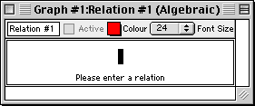
Figure 1.1: A blank algebraic relation window
The algebraic relation window consists of the following elements:
- a title bar,
- a parameter bar, and
- some constraint fields.
In addition, an easy button floating window
is available for help in relation entry. Easy buttons are especially useful when
entering symbols not readily available from the standard keys on a keyboard.
For details, refer to the Easy Button Floating Window chapter.
The elements of the algebraic relation window are explained as follows:
| Hint: | An algebraic window’s title bar, parameter bar, and relation constraints
are synchronized with, or equivalent to, their structural relation window counterparts.
Custom ticks windows have the same setup for title and parameter bars. Therefore,
the corresponding manual sections are equivalent. |
|
- Title bar
- The title bar displays the graph title and the relation title followed by
the “(Algebraic)” label, which helps identify the window as an algebraic relation window.
The relation title can be changed using the parameter bar's title edit box. Figure 1.2 shows the title bar:

Figure 1.2: The title bar of an algebraic window
- Parameter bar
- The parameter bar is for customizing the relation title, starting and
stopping graphing, modifying the graph colour, and changing the font size
used to display contraints within the algebraic relation window.
Figure 1.3 shows the parameter bar:

Figure 1.3: The parameter bar of an algebraic window
The elements, from left to right, are explained as follows:
- Title edit box
- The title edit box is for changing the relation’s title.
Custom titles are useful in demonstrations and for print-outs.
The default title, “Relation #1”, is easily changed:
click on the title edit box to start editing.
The new title will replace the old one in all menus,
windows, and buttons that show the relation’s title.
- Active checkbox
- The Active checkbox is for starting and stopping relation plotting
in open graph view windows.
Clicking on the checkbox, or the checkbox name, toggles between the selected and
unselected states.
Deselecting the checkbox halts graph plotting and hides the relation from all graph views.
Selecting the checkbox resumes graph plotting from where it left off and shows the relation
in all graph views.
| Hint: | The Active checkbox is greyed out and unavailable if any relation constraints
within the window are invalid. |
|
- Colour pop-up menu
- The Colour pop-up menu is for changing the colour used for the
relation in graph views.
This control is useful for optimizing the clarity of graph views.
The colour can be changed by clicking on the Colour
box to access the pop-up colour menu,
and then selecting the desired colour from the menu.
For black-and-white graphs, a Pattern pop-up menu replaces the
Colour pop-up menu.
Colour computers can display black-and-white graphs. For more information,
refer to the colour buddy section of the
View Buddy Floating Window chapter.
- Font Size pop-up menu
- The Font Size pop-up menu is for changing the font size used to display
relation constraints in the relation window.
This control is useful for presentations via an overhead liquid
crystal display (LCD) or a large screen television. The font size can be changed by
clicking on the Font Size pop-up menu to bring up a
menu of available font sizes, and then selecting a new size from the menu.
All constraints of the current algebraic relation window will be displayed in the
selected font size.
| Hint: | Some options in the algebraic relation window’s parameter bar do not change
the behaviour or the appearance within the algebraic window itself.
- The Active checkbox affects the behaviour (graphing) of
graph view windows.
- The Colour pop-up menu affects the appearance (graph colour)
of graph view windows.
|
|
- Constraint fields
- Constraint fields are for entering relation constraints. The constraints entered
are displayed in standard mathematics format.
While a constraint is being entered, prompts appear at the bottom of the constraint field
to offer basic tips during the specification process.
Figure 1.4 shows a sample relation with two constraints (in two constraint fields):
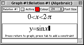
Figure 1.4: An algebraic window with two constraint fields
While a constraint is being entered or changed,
- prompts appear at the bottom of its field,
- a blinking cursor is available,
- the Active checkbox of the algebraic window is unselected, and
- the easy button floating window is available.
Relation constraints are presented in standard mathematics format.
When functions are entered using multiple characters, the characters
are presented in red until GrafEq recognizes them as a function name:
red signifies unrecognized entries. GrafEq can interpret
“sin” as the sine function, instead of the product “s×i×n”,
only after an argument, such as x, is entered. A good example is the square root function,
when entered as “sqrt”: GrafEq will replace the letters with a graphical
radical symbol only after an argument is started.
Standard mathematics format is desirable when including relations in handouts or documents,
and can be done by copying relations from GrafEq and pasting them into a word processor.
The formatted presentation also gives some visual feedback that constraints are
interpreted as intended.
You can move from one constraint to the next by pressing the tab key;
if there is no next constraint, a new one will be created.
Pressing the tab key while the shift key is held down will move you on
to the previous constraint; if there is no previous constraint,
a new one will be created.
| Hint: | If the cursor is positioned away from the end of the relation string
during editing, all characters to the right side of the cursor become unformatted. |
|
| Hint: | With the default preference settings, unformatted characters are
shown in solid red on colour displays, but are outlined in black
(not filled in) on black-and-white displays. |
|
| Tip: | The “Symbol” and “Times” TrueType fonts must be installed
in order to produce attractive screen output, unless the font settings have been
changed in the preferences. |
|
| Tip: | More information on the format and structure of constraints and
the parser is available in the How GrafEq Works chapter. |
|
Conclusion
To conclude this chapter of the manual,
here are some additional hints and tips about the algebraic relation window:
- Each algebraic relation window describes one relation; the relation can
be defined using a single constraint or multiple constraints. Additional
constraint fields can be
brought up by pressing the tab key from within the algebraic relation window.
- Each graph can have one or more relations. Each relation is described in one
algebraic window, and is normally assigned a colour different from that of the other
relations. Additional algebraic windows can be opened
by selecting New Relation from the Graph menu.
Relations from the same graph are plotted on the same views, using the same coordinate system.
- New graphs can be opened by selecting New Graph from the File menu.
When a new graph is opened, a new algebraic relation window appears automatically.
The default graph title is “Graph #k”, where k is
a new sequence number. Different graphs are unrelated; to view multiple relations
in the same window, multiple relations are created within one graph.
- Besides the algebraic window, each relation may be presented using a tree structure
in a structural relation window. Corresponding algebraic and structural windows are
synchronized, so common attributes describing the relation can be
changed in either window, and are reflected in both.
Examples of common attributes include the relation title, graphing activity,
and relation colour.
The tree structure representation in the structural relation window is
a new feature introduced in GrafEq 2.04. For details, see the
Structural Relation Window chapter.
- The keystrokes field is a strip beneath the current constraint field. It shows the
keystrokes used to produce the formatted relation in the
constraint field. Keystroke information is especially useful when the intuitive mathematics
symbols and notation have no obvious correspondance with the keys on a keyboard.
Figure 1.5 shows a sample keystrokes field with its corresponding constraint field:
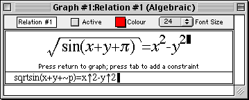
Figure 1.5: An algebraic window with its keystroke field
Prior to version 2.04, GrafEq always provided this information via the keystroke field.
But as of GrafEq 2.04, keystroke information can be revealed within
the constraint entry fields by positioning the cursor to the left of the entries.
The keystroke field is hidden using the default preferences, although
it is still available and remains useful for printing purposes.
To display the keystrokes field, change the preferences.
- A relation entry can be completed by selecting the
Active box of its algebraic window or by pressing the return key.
When relation entries are completed,
the algebraic window will collapse to display just the title bar, parameter bar, and
constraint fields - prompts, the blinking cursor, the keystroke field, and
the easy button floating window
will disappear. The Active checkbox will be selected, but it can be freely
deselected and selected without editing any constraints.
- Clicking within any constraint field of a completed algebraic window
will return you to the edit mode and remove the relation
from any opened graph views.
Chapter 2. The Easy Button Floating Window
The easy button floating window provides buttons that
assist you in entering relations. Easy buttons are especially useful when entering
symbols not readily available from the keys on a standard keyboard.
The easy button floating window automatically appears when
a relation or custom ticks definition is being edited.
It can be shown, or hidden, by selecting Easy Buttons
from a Relation menu or a Custom Ticks menu.
Buttons within the floating window are organized into groups,
based on common usage: related symbols and operations are contained
within each group.
These groups are presented in alphabetical order.
Figure 2.1 shows the easy button floating window displaying group
headings, with only the Basic group of easy buttons expanded:

Figure 2.1: The default easy button floating window
Details about the easy buttons are explained in Appendix A, the Easy Buttons appendix.
Following are some notes about the floating window:
- The easy button floating window appears when a relation or a custom ticks definition
is being edited. It is otherwise hidden, but returns once a relation or a
custom ticks definition is being edited.
| Hint: | The easy button floating window disappears when relation editing is completed
or a new window or program is activated. |
|
- Each group of easy buttons can be expanded, to display its
easy buttons below its title, or collapsed, to display just its title,
by clicking on the name of the group, or the triangular arrow beside the name.
- Groups can be removed from, or added to,
the easy button floating window by
changing the preference settings, as follows:
- From the File menu, select Preferences;
- expand Algebraic Window;
- expand Easy Buttons;
- expand Access; then
- select the desired groups’ checkboxes under the Available column to add
those groups; deselect the undesired groups’ checkboxes to remove those groups.
| Hint: | If a group’s checkbox is not selected under the Available column,
the buttons of that group will not be accessible at all.
By default, the Measure, Numbers, and Roman groups
are not available; all of the other groups are available.
To have an available group automatically expand at startup, like the
Basic group does by default, select the group’s checkbox
in the Expand on Startup column.
Expanding and collapsing available groups is often done, during a session,
by clicking on the name of the corresponding group, or on the
triangular arrow beside the name.
|
|
- To automatically keep the easy button floating window hidden while editing relations,
change the preferences as follows:
- From the File menu, select Preferences;
- expand Algebraic Window;
- expand Easy Buttons; then
- deselect the Show easy buttons checkbox.
- To hide the easy button floating window during a session,
click on the window’s close box, or deselect Easy Buttons from
a Relation menu or a Custom Ticks menu.
Chapter 3. The Structural Relation Window
The structural relation window is a new feature introduced in GrafEq 2.04.
It displays a flow chart (a treelike, structural representation) for a relation.
The window can be brought up by selecting Relation #k (Structure)
from the Graph menu, or selecting Structural Window from
a Relation menu.
The structural window is helpful for understanding,
and confirming, operator precedence within a relation.
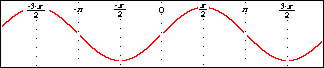
Figure 3.1 shows a structural relation window displaying the relation y=sinx:

Figure 3.1: A structural relation window displaying y=sinx
The structural relation window consists of the following elements:
- a title bar,
- a parameter bar,
- a tree structure field, and
- a tree control bar.
The elements of the structural relation window are explained as follows:
| Hint: | A structural relation window’s title bar, parameter bar, and its
relation description are synchronized with, or equivalent to, their
algebraic relation window counterparts.
Custom ticks windows have the same setup for title and parameter bars. Therefore,
the corresponding manual sections are equivalent. |
|
- Title bar
- The title bar displays the graph title and the relation title followed by
the “(Structural)” label, which helps identify the window as a structural relation window.
The relation title can be changed using the parameter bar's title edit box. Figure 3.2 shows the title bar:

Figure 3.2: The title bar of a structural relation window
- Parameter bar
- The parameter bar is for customizing the relation title, starting and stopping graphing,
modifying the relation colour, and changing the font size used to display elements
of the structural representation.
Figure 3.3 shows the parameter bar:

Figure 3.3: The parameter bar of a structural relation window
The elements, from left to right, are explained as follows:
- Title edit box
- The title edit box is for changing the relation’s title.
Custom titles are useful in demonstrations and for print-outs.
The default title, “Relation #1”, is easily changed:
click on the title edit box to start editing.
The new title will replace the old one in all menus,
windows, and buttons that show the relation’s title.
- Active checkbox
- As with the Active checkbox in the algebraic window paramenter bar,
the structural relation window’s Active checkbox is for starting
and stopping relation plotting in open
graph view windows.
Clicking on the checkbox, or the checkbox name, toggles between the selected and
unselected states.
Deselecting the checkbox halts graph plotting and hides the relation from all graph views.
Selecting the checkbox resumes graph plotting from where it left off and shows the relation
in all graph views.
| Hint: | The Active checkbox is greyed out and unavailable if any relation constraints
within the window are invalid. |
|
- Colour pop-up menu
- The Colour pop-up menu is for changing the colour used for the
relation in graph views.
This control is useful for optimizing the clarity of graph views.
The colour can be changed by clicking on the Colour
box to access the pop-up colour menu,
and then selecting the desired colour from the menu.
For black-and-white graphs, a Pattern pop-up menu replaces the
Colour pop-up menu.
Colour computers can display black-and-white graphs. For more information,
refer to the colour buddy section of the View Buddy Floating Window chapter.
- Font Size pop-up menu
- The Font Size pop-up menu is for changing the font size used in the
tree nodes. This control is useful for presentations via an overhead liquid
crystal display (LCD) or large screen television. The font size can be changed by
clicking on the Font Size pop-up menu to bring up a
list of available font sizes, and then selecting a new size from the menu.
| Hint: | The font size of the structural relation window affects the tree structure field,
while the font size of the algebraic window affects the constraint fields.
However, the title edit box, Active checkbox, and Colour
pop-up menu of corresponding structural and algebraic relation windows are identical,
and are synchronized. Changes in one will be reflected in the other.
Some controls in the structural relation window’s parameter bar do not change
the behaviour or the appearance within the structural window itself.
- The Active checkbox affects the behaviour (graphing) of
graph view windows.
- The Colour pop-up menu affects the appearance (graph colour)
of graph view windows.
|
|
- Tree structure field
- The tree structure field displays a relation
using a tree structure. The tree structure is updated as the relation is
entered. Figure 3.4 shows the sequence of tree structures displayed
as the relation y=sinx is entered:
Figure 3.4: The sequence of tree structures displayed as y=sinx is entered
- Tree control bar
- The tree control bar is for customizing general attributes of the tree structure field,
including node colour and tree structure format. Figure 3.5 shows the tree
control bar:

Figure 3.5: The tree control bar of a structural relation window
The elements, from left to right, are explained as follows:
- Node Colour pop-up menu
- The node Colour pop-up menu is for changing the colour used to display
tree nodes in the structural window.
This control is useful for optimizing the clarity of the displayed tree structure.
The colour can be changed
by first clicking on the colour pop-up to bring up the pop-up colour menu,
and then selecting the desired colour from the menu.
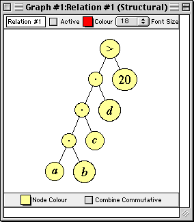
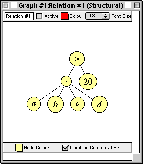
- Combine Commutative checkbox
- The Combine Commutative checkbox is for
combining commutative operations within the tree structure.
Clicking on the checkbox toggles between its selected and unselected states.
Figure 3.6 shows two tree structures for the same relation: The one the left,
with the Combine Commutative unselected, shows a full, binary tree structure.
The one on the right, with the Combine Commutative selected, shows a
flatter tree structure, with commutative operations combined together.
|
|
|
Binary
|
n-ary
|
Figure 3.6: Alternative tree structure presentations
Conclusion
To conclude this chapter of the manual,
following are some additional hints and tips about the structural relation window:
- Each structural relation window describes one relation; the relation can
consist of a single constraint, or have multiple constraints. Constraints are linked together
using an “and” operation.
- A structural window can be brought up by selecting
Relation #n (Structure) from the Graph menu.
- Each structural relation window is associated with an algebraic window, and both
describe the same relation. Corresponding structural and algebraic windows are
synchronized, so common attributes describing the relation can be
changed in either window, and are reflected in both.
Common attributes include the relation title, graphing activity,
and relation colour. For details about the algebraic window, see the Algebraic Relation Window chapter.
- A relation’s structural window, algebraic window,
and easy button floating window can be shown or hidden by selecting or deselecting
the appropriate option from a Relation menu. A Relation menu
appears only when an algebraic or structural relation window is foremost.
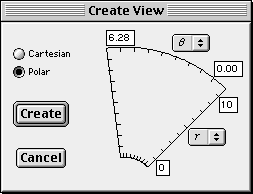
Chapter 4. The Create View and View Options Dialog Boxes
The create view dialog box is for specifying the options used for creating a new view window.
Example options include the graph type (cartesian or polar)
and view scope (variables and bounds).
It can be brought up by selecting New View from the Graph menu.
It appears automatically if the current graph does not have any views open, and
a relation specification is completed by pressing the return key.
The create view dialog box has two modes;
a cartesian mode and a polar mode,
as shown in figure 4.1, with cartesian on the left, and polar on the right:
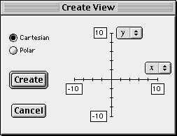
|
|
|
Cartesian mode
|
Polar mode
|
Figure 4.1: Two create view dialog boxes
The create view dialog box contains the following elements:
- two graph radio buttons,
- a domain and a range pop-up menu,
- four bound edit boxes,
- a Cancel button, and
- a Create button.
The elements of the create view dialog box are explained as follows:
- Cartesian and Polar radio buttons
- The Cartesian and Polar radio buttons are for changing the
coordinate system used for plotting. They are in the upper left area of the create view dialog box.
GrafEq sets the mode to Polar if r or q are present in the constraint
specification; otherwise, GrafEq sets the mode to Cartesian.
The mode can be changed by clicking on the other radio button or on its name.
| Hint: | If x and/or y, as well as r and/or q, is used in a relation specification,
GrafEq sets the mode to Cartesian. |
|
- Domain and range pop-up menus
- A variable pop-up menu is adjacent to each of the domain and range axes. They are for
specifying the variables used for each axis of the new view.
In the Cartesian mode, the variables default to x and y;
in the Polar mode, they default to r and q.
For a graph specified in variables other than x and y, or r and q,
the variables can be changed by
clicking on the respective pop-up menu to bring up the menu of available
variables, and then selecting a new variable from the menu.
- Bound edit boxes
- Two sets of upper and lower bound edit boxes are adjacent to each of the
domain and range variable axes.
They are for specifying the bounds of the graph.
In Cartesian mode, the default bounds are -10 to 10 for both x and y;
in Polar mode, the default bounds are 0 to 10 for r, and 0 to 6.28 for q.
Any of the bounds can be changed by first clicking inside their
respective edit boxes, and then editing the values.
| Hint: | Instead of the mouse, the tab key or the arrow keys can be used to move among the edit boxes. |
|
- Create button
- The Create button is in the center left area of the create view dialog box.
It can be used in one of the following two ways:
- Simply click on the Create button and the following will happen:
- The create view dialog box will close.
- A
view window, as specified
in the create view dialog box, will open.
- Plotting of all active relations of the current graph will commence in the new view.
- While holding down the option key, click on the Create button and
the following will happen:
- The create view dialog box will close.
- The view options dialog box, which provides additional options and
controls, will appear. More details are described in the next section.
- Cancel button
- The Cancel button is for aborting the creation of a new graph view. It is
in the bottom left area of the create view dialog box.
Clicking on it will simply close the create view dialog box without creating a new view.
View Options Dialog Box
The view options dialog box provides options and controls in addition to those found in the
create view dialog box, including an option for
overriding automatic graphing activity,
overriding automatic colour display,
and choosing a custom view size.
The view options dialog box is accessed from the
create view dialog box by
clicking on the Create button while holding down the option key.
Figure 4.2 shows a view options dialog box:
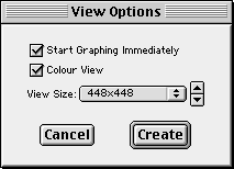
Figure 4.2: A view options dialog box
The view option dialog box contains the following elements:
- a Start Graphing Immediately checkbox,
- a Colour View checkbox,
- a View Size pop-up menu and arrow buttons,
- a Cancel button, and
- a Create button.
The elements of the view option dialog box are explained as follows:
- Start Graphing Immediately checkbox
- The Start Graphing Immediately checkbox is for controlling whether GrafEq starts plotting
immediately after the graph view is created (by automatically selecting the
Graph checkbox in the view window’s paramter bar), or waits until the
Graph checkbox in the view window’s parameter bar is selected to
start plotting. This option can be useful for presentation purposes.
Clicking on the checkbox toggles between the selected and unselected states.
- Colour View checkbox
- The Colour View checkbox is for choosing between a colour view or
a black-and-white view.
The black and white option is useful for printing to a black-and-white printer.
Clicking on the checkbox toggles between the selected and unselected states.
| Hint: | The black and white option is also useful for exporting to another application,
such as a word processor, for further processing and subsequent black-and-white printing.
|
|
- View Size pop-up menu and arrow buttons
- The View Size pop-up menu and arrow buttons are for changing the
size of the graph view on the monitor. GrafEq determines the default view size according
to the size of the monitor used. The size can be changed in two ways:
- Click on the View Size pop-up to bring up a menu of
available sizes, and then select a size from the menu.
- Click on the up arrow button to ascend (or the down arrow button to descend)
through the list of available sizes.
| Hint: | View dimensions are measured in pixels.
For high resolution display or printouts, select large values from the
View Size pop-up menu to achieve best results. |
|
- Cancel button
- This Cancel button is the same as the one in the create view dialog box. It is
for aborting the creation of a new graph view.
Clicking on it will simply close the view options dialog box without creating a new view.
- Create button
- The Create button is for setting off the following sequence of events:
- The view options dialog box will close.
- A new graph view, in accordance with the specifications given
in the create view and view options dialog boxes, will be created.
- If the Start Graphing Immediately checkbox was selected,
plotting of all active relations of the current graph will commence;
otherwise, GrafEq will wait until the Graph
checkbox in the view window’s parameter bar is selected before plotting is started.
Conclusion
To conclude this chapter of the manual,
following are some additional hints and tips about the
create view and view options dialog boxes:
- Both the create view dialog box and the view options dialog box are modal;
they must be finished with and closed before other GrafEq windows or features
can be accessed. Pressing the Cancel button closes the box. Pressing
the Create button removes the box and also creates a new view window,
as explained earlier.
- If the create view dialog box is brought up by pressing the return key from an
algebraic relation window, the relation specification is completed:
the algebraic window collapses to display just the title bar, parameter bar and
constraint field(s) - prompts, the blinking cursor, the keystrokes field, and the easy
button floating window will all disappear.
Chapter 5. The View Window
The view window is for displaying, and investigating, graphs of relations.
GrafEq produces graphs using an iterative process: a rough approximation to the graph
is first presented, which is then refined over time. Eventually, a correctly
plotted graph of all active relations will be displayed. For more information
about the plotting process, see the How GrafEq Works chapter.
A view window can be created by pressing the Create button of either
the create view dialog box or
the view option dialog box.
| Hint: | The create view dialog box appears automatically if
a relation specification is completed by pressing the return key and
the current graph does not have any open views.
The dialog box can also be brought up by selecting New View from the Graph menu;
additional views can be opened this way.
The view options dialog box is accessed from the
create view dialog box,
by clicking on the Create button while holding down the option key.
|
|
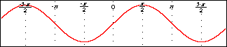
Figure 5.1 shows a view window displaying a graph with one active relation, y=sinx:
| Hint: | Initial settings are adopted from both the create view and
the view option dialog boxes. |
|
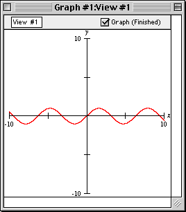
Figure 5.1: A view window displaying a graph with one active relation, y=sinx
The view window consists of the following elements:
- a title bar,
- a parameter bar, and
- a view region.
The elements of the view window are explained as follows:
- Title bar
- The title bar displays the graph title
and the view title. The view title can be changed
using the parameter bar’s title edit box. Figure 5.2 shows the title bar:

Figure 5.2: The title bar of a view window
- Parameter bar
- The parameter bar is for customizing the view title,
showing graphing status, controlling graphing activity, and displaying
the percentage of the graphing area that has been
proven to be correct.
Figure 5.3 shows the parameter bar:

Figure 5.3: The parameter bar of a view window
The elements, from left to right, are explained as follows:
- Title edit box
- The title edit box is for changing the view’s title.
Custom titles are useful in demonstrations and for print-outs.
The default title, “View #1”, is easily changed:
click on the title edit box to start editing.
The new title will replace the old one in all menus,
windows, and buttons that show the view’s title.
- Graphing barber pole
- The graphing barber pole relays graphing activity. It revolves while
the graph is being plotted. It is replaced with a blank bar
if graphing is stopped, but not completed. It disappears when graphing has been completed:
an absent bar means that the displayed graph has been proven to be correct in every detail.
- Graph (...) checkbox
- The Graph (...) checkbox lets you pause, and resume, graphing.
Graphing occurs when the checkbox is selected:
clicking on the checkbox toggles between the selected and unselected states.
A progress report is shown in brackets; explanations of the common
progress reports follow.
- “Waiting” means that graphing has not started.
- “>p% Proven”, with a single relation, means that
more than p percent of the displayed pixels have been proven to
be correctly coloured. With multiple relations, the average of the
amounts proven for each relation is under-reported. For example,
with two relations, one finished and the other just begun,
the progress report would be “>49.9% Proven”.
- “Finished” means that graphing has completed.
The following explains the reports that are shown when graphing cannot continue.
- “Memory Stall” means that there is not enough available memory
for graphing to continue.
Increasing the amount of memory available to GrafEq may help.
- “Subdivisions Exhausted” means that even though the remaining (uncertain)
pixels have been divided into the finest mesh GrafEq can use,
no more proofs were forthcoming. Changing the syntactic form of the relation or
zooming into the region of interest may help.
- “Precision Exhausted” means that GrafEq’s underlying number
system does not have enough precision for graphing to progress.
A correct graph of the desired area may be possible by introducing scaling
and/or translation transformations into the relation.
| Hint: | If the Graph checkbox is deselected after graphing has finished, no
change will occur. |
|
- View region
- The view region is the main part of the view window:
it displays the current view of the graph.
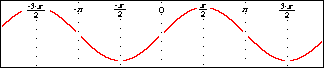
Figure 5.4 shows a sequence of view windows displaying progressive stages
of graph plotting, finishing with the completed plot.
Figure 5.4: Progressive stages of graph plotting
| Hint: | Ticked axes are applied to the view according to the current preference settings.
They can be customized across sessions by modifying the preference settings, which
are accessed by selecting Preferences under the File menu.
The ticked axes can be turned off, for the current view window only,
by deselecting Ticks in the
colour view buddy.
More controls over the ticked axes are available in
the ticks view buddy.
The ticks view buddy has many controls besides those for
turning ticks on and off. Refer to the View Buddy Floating Window chapter for details. |
|
Following is a summary of the controls of, and the various attributes of, the view window and
its view region:
- The choice of the coordinate system used (cartesian or polar),
the axes variables, and
the initial view bounds (view scope) are made in the
create view dialog box.
- A graph view’s on-screen dimensions are set in the
view options dialog box.
- The choice between a colour graph and a black-and-white graph is made in the
view options dialog box.
This choice can be changed by using the colour view buddy.
| Hint: | The colour view buddy has many controls
besides simply turning colour display on and off. Refer to the View Buddy Floating Window chapter
for details. |
|
- Each view window has a view buddy floating
window, which appears automatically when a graph window is foremost.
The view buddy provides tools for interpreting and augmenting a graph and
its views. Refer to the View Buddy Floating Window chapter for details.
Conclusion
To conclude this chapter of the manual,
following are some additional hints and tips about the view window:
- Each view window displays one view of a graph.
| Hint: | A graph can include one or more relations; a relation can be
described by one or more constraints. |
|
A graph can have multiple views. Each view shows all active relations of the graph
within its specified view scope, using the options chosen for that view.
Multiple views are useful for comparing different graphs, or
for comparing different regions of the same graph.
- Additional views can be created by
selecting New View from the Graph menu.
The desired display may be obtained by
customizing the options in the create view dialog box (and
possibly the view options dialog box).
Chapter 6. The View Buddy Floating Window
The view buddy floating window provides tools for interpreting and augmenting
a graph and its views. It appears automatically when a view window is foremost.
Figure 6.1 shows the view buddy window in its initial mode, colour:
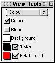
Figure 6.1: The view buddy floating window in its initial mode, colour
The view buddy has seven different modes.
Colour mode is the initial mode, and is shown in figure 6.1 earlier.
The other modes are accessable by clicking on the mode pop-up menu,
and then selecting a new mode from the menu that pops up.
The mode pop-up menu is at the very top of the view buddy floating window.
View buddy modes include:
- information mode,
- colour mode,
- ticks mode,
- zoom mode,
- draw mode,
- one point mode, and
- two point mode.
Before going into details about the different modes of the view buddy, following are
some hints and general instructions about the floating window and its modes:
- The view buddy floating window appears only when a view window is foremost.
It is otherwise hidden, but returns when a view window is activated.
- Options in the information, ticks, draw, one point, and two point modes
apply only to the one view window directly associated with the view buddy.
Options in the colour and zoom mode apply to all view windows of the associated graph.
- Following are some general instructions:
- Selecting an option’s checkbox activates the option;
clicking on a checkbox or its name toggles between its
selected and unselected states;
- Clicking on a pop-up menu opens the pop-up menu,
so the desired option can be selected from it.
- The colour mode is the initial mode since its options are
useful for optimizing the clarity and readability of graph views.
Information Buddy
The information buddy displays advanced, technical data about the graphing process.
It is accessed by selecting “information” from the buddy mode pop-up menu at
the top of the floating window.
Figure 6.2 shows the information buddy displaying data for the graph view as a whole:
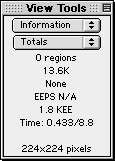
Figure 6.2: The information buddy displaying data for the graph view as a whole
The information buddy has several different sub-modes. “Totals” sub-mode is the default,
as seen in figure 6.2 earlier. It displays data for the graph as a whole.
Other modes display data for an individual relation of the graph.
Each mode is accessed using the sub-mode pop-up menu,
which is just below the mode pop-up menu at the top of the view buddy floating window
All information displayed applies to the immediately associated
graph view only. The data elements, from top to bottom, are
explained as follows:
- Number of regions
- This element shows the number of rectangular blocks remaining to be refined by GrafEq.
When plotting is completed, the number of regions will be zero.
- Memory allocated
- This element shows the RAM being used by the graph.
It varies with the complexity of the graph and the plotting technique employed.
When plotting is completed, it shows the RAM required for
displaying the plotted graph in the view window.
- Scheduling pedigree
- This element shows the plotting technique currently being used by GrafEq.
Plotting techniques include the following:
- Dynamic: GrafEq is refining along the perimeter of the graph.
This is the fastest technique, but requires the most memory.
- Perimeter scanning: GrafEq is refining along the perimeter of the
graph. This is the second fastest plotting technique.
- Area scanning: GrafEq is refining everywhere inside the graph. This
is the slowest plotting technique, and requires the least memory.
- Static: GrafEq is refining either by perimeter or area scanning.
- None: GrafEq has not refining the graph.
- Evaluation speed
- This element shows the up-to-the-moment average rate of graph processing.
It varies with the complexity of the graph relations,
processor speed, and memory resources.
Evaluation speed is measured in
Equation Evaluations Per Second (EEPS), Kilo EEPS (KEEPS), or Mega EEPS (MEEPS).
When graphing is completed, this rate will be removed from the display.
- Total number of evaluations
- This element shows the total number of evaluations performed by
the graphing process. It varies with the complexity of the graph view.
The number of evaluations is measured in
Equation Evaluations (EE), Kilo EE (KEE), or Mega EE (MEE).
When graphing is completed, this number will stop changing.
- CPU time/total time
- This element shows the time spent on graph plotting.
CPU time measures the amount of time the CPU has spent on graphing
after factoring out the time spent on other tasks.
Total time measures the total amount of time that has elapsed since
graphing started. Any time that elapsed while the graphing process
was deactivated (by deselecting the Graph (...) checkbox)
is not included in the total time (or in the CPU time).
| Tip: | If CPU time is small relative to total time, closing non-essential
windows and/or quitting other programs will increase graphing
speed, as GrafEq will be able to use more CPU time for graphing. |
|
- Dimensionality
- This element shows the dimension refining is occuring in. Even through
GrafEq presents graphs using two dimensional views, GrafEq may be
processing relations in higher dimensions if relations include
variables other than the axes variables.
- View size
- This element is available only in the “totals” sub-mode. It shows the view region’s
width and height, in pixels.
- Show Work checkbox and colour pop-up menus
- These elements are not available in the “totals” sub-mode:
they are for showing detailed plotting information for a relation.
When Show Work is selected, several colours will be used to
convey graphing information, instead of the usual two, as follows:
- pixels that are proven to contain solutions have the appropriate relation’s colour;
- pixels that are proven to not contain solutions have the background’s colour; and
- pixels not yet proven to contain, or not to contain, solutions, have the work area colour.
Two colour pop-up menus are provided for the work area.
If the colours selected are different,
work areas will flash between the two selected colours.
If they are the same, work areas will appear in the one colour,
and will not flash. Different colours are useful when using a black-and-white display.
- Background colour pop-up menu
- This pop-up menu is for conveniently changing
the colour used for the graph’s background. It might be useful for making work areas stand out.
| Hint: | The Background colour pop-up menu is also in the colour buddy (which
is explained in the next section). The two Background pop-up menus are
synchronized. |
|
The contents of the information view buddy can be customized using the preferences.
For details, refer to the Preferences chapter.
Colour Buddy
The colour buddy is for changing the appearance of graph views.
It is accessed by selecting “colour” from the buddy mode pop-up menu at
the top of the floating window.
Figure 6.3 shows the colour mode view buddy:
Figure 6.3: The colour buddy
All colour view buddy options apply to all view windows of the associated graph.
The elements, from top to bottom in the colour buddy, are explained as follows:
- Colour checkbox
- The Colour checkbox is for toggling between a colour view and
a black-and-white view. The black and white option is useful for
printing to a black-and-white printer.
- Blend checkbox
- The Blend checkbox is for toggling between a blended graph and a layered graph.
Blending is useful for showing intersecting areas
when graphing multiple regions, such as those given by inequalities.
A layered graph initially displays relations in the order that their respective relation windows
are opened, earliest at the bottom, latest at the front.
The layers can be reordered by hiding and showing relations. Click
on a relation’s checkbox to hide and show that relation.
- Background colour pop-up menu
- The Background colour pop-up menu is for changing
the colour used for the graph’s background.
For black-and-white graphs, the background colour can be either solid black or solid white.
- Ticks pop-up menu and checkbox
- The Ticks colour pop-up menu is for changing the colour used for the ticks.
For black-and-white graphs, the ticks can be either black or white.
The Ticks checkbox is for showing and hiding the ticks.
- (optional) Custom ticks colour pop-up menus and checkboxes
- Each custom ticks pop-up menu and checkbox is similar to the Ticks
pop-up menu and checkbox, but control display options for custom ticks instead of ticks.
| Hint: | Custom ticks colour pop-up menus are synchronized with the pop-up menus in the
custom ticks windows. |
|
- (one or more) Relation colour pop-up menus and checkboxes
- Relation colour pop-up menus are for changing
the colours used to display relations.
For black-and-white graphs, patterns are chosen instead of colours; a pattern pop-up
menu is available instead of a colour pop-up menu.
| Hint: | Relation colour (or pattern) pop-up menus are synchronized with the
Colour (or Pattern) pop-up menus
in algebraic and structural relation windows. |
|
The checkboxes adjacent to the colour pop-up menus are for
showing and hiding relations.
Ticks Buddy
The ticks buddy is for showing or hiding the ticks, selecting optional
tick components, and customizing the appearance of the ticks. It is accessed by
selecting “ticks” from the buddy mode pop-up menu at the top part of the floating window.
Figure 6.4 shows the ticks mode view buddy presenting the preconfigured ticks options:
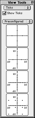
Figure 6.4: The ticks buddy presenting the preconfigured ticks
All options apply to the current view only.
The Show Ticks checkbox is the first option offered in the ticks buddy: it is just
below the mode pop-up menu. When the checkbox is selected, ticks are shown.
| Hint: | By default preference settings, ticks are shown automatically when new views are opened.
If GrafEq doesn't show ticks, graphing of
complex relations might be faster. For details about changing preference settings, refer
to the Preferences chapter. |
|
The ticks buddy provides four different ticks sub-modes. “Preconfigured” is the default sub-mode,
as seen in figure 6.4 earlier. Other sub-modes include “marks”, “outline”,
and “parameters”.
Each sub-mode is accessed using the pop-up menu below the Show Ticks checkbox.
The ticks sub-modes are explained as follows:
- Preconfigured
- The “preconfigured” sub-mode provides basic (simplified) tick options using
four buttons. Each button sets the ticks to a preconfigured setting, as follows:
- button 1: axes and sparse ticks;
- button 2: axes, sparse ticks, axes labels, and bounds;
- button 3: axes, dense ticks, axes labels, and bounds;
- button 4: axes, dense ticks, axes labels, and bounds, and grid cross ticks.
| Tip: | This option can be used for making graph paper. |
|
|
Figure 6.5: The “preconfigured” sub-mode of the ticks buddy
|
- Marks, outline, and parameters
- “Marks”, “outline”, and “parameters” sub-modes are for fine control of
the appearance of the tick’s components. Option are offered using expandable lists.
- Collapsed lists can be expanded by clicking on the list’s title, or on the adjacent
triangular arrow.
- Expanded lists reveal their elements, some of which may be expandable sub-lists.
Revealed list elements can then be selected individually; expandable sub-lists can
then be further expanded.
- Each list has a checkbox; all list items can be conveniently selected or
deselected using this checkbox.
A list which has elements that are selected as well as elements that
are not selected displays a horizontal bar in its checkbox.
- Expanded lists can be collapsed by clicking on the list’s title, or on the adjacent
triangular arrow.
- Marks
- This sub-mode is for selecting which tick components are shown. The various marks are useful
for interpreting the graph, and for augmenting its display. Figure 6.6 shows all of the options:
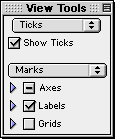
Figure 6.6: The “marks” sub-mode of the ticks buddy
- Outline
- This sub-mode is for setting the thickness of the optional outline around
tick components. A small area (an outline) may be placed around tick components,
which can imporve readability, especially in cluttered graphs.
Figure 6.7 shows the “outline” sub-mode:
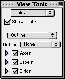
Figure 6.7: The “outline” sub-mode of the ticks buddy
- Parameters
- This sub-mode is for changing the font size used for tick labels and
the density of tick marks used.
Figure 6.8 shows the “parameters” sub-mode:
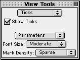
Figure 6.8: The “parameters“ sub-mode of the ticks buddy
- Font Size pop-up menu is for changing the font size for any displayed variables and
bound labels included in the ticks. The presence, or absence, of elements
is governed by the “marks” sub-mode.
- Mark Density pop-up menu is for changing the density of ticks, dots, and
crosses. The presence, or absence, of elements
is governed by the “marks” sub-mode.
Zoom Buddy
The zoom buddy is for zooming in and out of a graph. It is accessed by
selecting “zoom” from the buddy mode pop-up menu at the top part of the floating window.
Figure 6.9 shows a typical zoom mode view buddy:
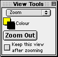
Figure 6.9: A typical zoom buddy
All zoom buddy settings are shared between all view windows.
The controls, from top to bottom in the zoom buddy, are explained as follows:
- Colour pop-up menus
- There is a pair of colour pop-up menus: the one on the upper left is for changing
the colour used for the inside the zoom box; the one on the lower right is for changing the colour
of used for the outline of the zoom box.
- Zoom Out button
- The Zoom Out button is for zooming out from the current graph view.
The new view will have the same center, but both the domain and the range will
be doubled; the new view will cover four times the area of the original view.
- Keep Current View checkbox
- The Keep Current View checkbox is for specifying whether
the current view is kept or discarded after a new view is created by zooming in or out.
Keeping the original view lets you compare graph views before and after zooming.
Discarding the original view saves memory and keeps the machines’s desktop clean and tidy.
- Zoom-in box
- The zoom-in box specifies the scope of the new view that GrafEq will zoom into.
It appears automatically when the mouse is within the graph view region.
Zooming in is done by clicking the mouse, or by pressing the return key,
while the area of interest is within the zoom-in box.
The size of the zoom-in box, and thus the scope it specifies, can be changed
by using the arrow keys: the left arrow narrows it, while the right arrow widens it;
the up arrow heightens it, while the down arrow shortens it.
| Hint: | The mouse is usually at the center of the zoom-in box. When the mouse is still
within the view region but far out towards one side, the zoom-in box stays within the
current view region by sticking to an edge.
As mentioned earlier, the colours of the zoom-in box are controlled by
the colour pop-up menus at the top part of the zoom buddy. |
|
| Tip: | If the desired graph region is not shown in a current view because of
inappropriate view bounds, or because of zooming in, they
can be recovered by zooming out until the desired region is again within the view scope.
Specific regions may then be examined by zooming back in. |
|
Draw Buddy
The draw buddy is for accessing drawing tools which are useful for augmenting the
display of graph views.
It is accessed by selecting “draw” from the buddy mode pop-up menu on the
top part of the floating window.
Figure 6.10 shows a typical draw mode view buddy:
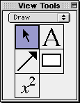
Figure 6.10: A typical draw buddy
All drawings appear on the draw buddy’s immediately associated view only.
The draw buddy provides access to a selection tool, an arrow tool, a box tool,
a text tool, and a formula tool.
Each draw tool is accessed by clicking on a button in the draw buddy window,
and presents its options and controls using a separate floating window.
If an object is currently selected, a tool’s controls will modify that
object; otherwise, the controls will modify the default settings for that
tool, which affect all objects subsequently created.
Draw tools provide elaborate support for augmenting graph views.
Details are available in Appendix III.
One Point Buddy
The one point buddy displays the coordinates of the point the cursor is currently over.
It also provides a magnified view of the area around the point.
The one point buddy is accessed by selecting “one point” from the buddy mode pop-up menu
at the top part of the floating window.
Figure 6.11 shows the one point buddy:
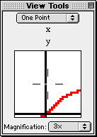
Figure 6.11: The one point buddy
One point buddy controls apply to its immediately associated view only.
The buddy elements are explained as follows:
- Coordinates field
- The coordinates field displays the domain and range coordinates of the cursor point
if the mouse cursor is within the graph view region. Coordinates values are given
with error corrections.
- Magnified view box
- The magnified view box displays a magnified view of the region around the cursor.
- Magnification pop-up menu
- The Magnification pop-up menu is for changing the magnifying factor for the
magnified view box. Supported magnification ranges from half-time(1/2x) to
five-times(5x).
| Hint: | From within the one-point buddy, curve riding is possible by holding down the
shift key while moving the mouse. |
|
Two Point Buddy
The two point buddy displays the coordinates of two selected points A and B,
and attributes of the line formed from joining A and B.
The buddy is accessed by selecting “two point” from the buddy mode pop-up menu
at the top part of the floating window. The two points, A and B, can be
relocated, one at a time, by clicking on them, then dragging them to new locations.
Figure 6.12 shows the two point mode view buddy:
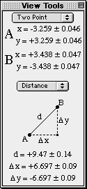
Figure 6.12: The two point buddy
Two point buddy controls apply to its immediately associated view only.
Two point buddy elements are explained as follows:
- Coordinates field
- The coordinates field displays the domain and range coordinates of A and B.
Coordinates values are given with error corrections.
- Attribute pop-up menu and attribute data field
- The attribute pop-up menu is for changing the data type displayed in
the attribute data field. Attribute options are listed and described as follows:
- trig - cosine, Dx, and sine, Dy of the line AB.
- slope - asymptote, h, and slope, m of the line AB.
- distance - distance, Dx, and Dy between A and B.
- degrees - angle formed by the line AB and a horizontal line through A, in degrees.
- radians - angle formed by the line AB and a horizontal line through A, in radians.
All attribute data are given with error corrections.
Chapter 7. The Custom Ticks Window
The custom ticks window is for adding user specified ticks as
interpretations aids to view windows.
It can be brought up by selecting
New Custom Ticks from the Graph menu.
Figure 7.1 shows a blank custom ticks window:
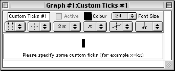
Figure 7.1: A blank custom ticks window
The custom ticks window consists of the following elements:
- a title bar,
- a parameter bar,
- a ticks control bar, and
- some tick specification fields.
| Hint: | The custom ticks window is very similar to the algebraic relation window.
They have the following equivalent elements and properties:
- easy button support when editing constraint specifications,
- the title bar’s elements and functions,
- the parameter bar’s elements and functions,
- the constraint fields’ elements and functions, and
- the optional keystroke field below the current constraint field.
This chapter still provides a complete explanation of these elements and properties
so that the manual has a modular structure and can be used as a reference.
The description for the equivalent elements and properties are mirrored
in the Algebraic Relation Window chapter. |
|
An easy button floating window is available for help in entering custom ticks
spedifications. Easy buttons are especially useful when entering
symbols not readily available from general keyboard keys. For details, refer to the
Easy Button Floating Window chapter.
The elements of the custom ticks window are explained as follows:
- Title bar
- The title bar displays the graph title
and the custom ticks title. The default title, “Custom Ticks #1”, can
be changed using the parameter bar’s title edit box. Figure 7.2 shows the title bar:

Figure 7.2: The title bar of the custom ticks window
- Parameter bar
- The parameter bar is for changing the title, showing and hiding the custom ticks,
modifying the tick’s colour, and
changing the font size used to display the tick’s defining relation.
Figure 7.3 shows the parameter bar:

Figure 7.3: The parameter bar of the custom ticks window
The elements, from left to right on the custom ticks window parameter bar,
are explained as follows:
- Title edit box
- The title edit box is for changing the title of the current ticks specification.
Title editing is useful in demonstrations and for print-outs.
The default title, “Custom Ticks #1”, can be changed
by clicking on the title edit box to access the edit mode.
The new title will be reflected in all GrafEq menus, windows, and buttons
that show the custom tick’s title.
- Active checkbox
- The Active checkbox is for showing and hiding the custom ticks
in all opened graph
view windows.
Clicking on the checkbox, or the checkbox name, toggles between the selected and unselected states.
Deselecting the box hides the custom ticks from all graph views.
| Hint: | The Active checkbox is greyed out if the custom ticks definition
is not valid yet. |
|
- Colour pop-up menu
- The colour pop-up menu is for changing the colour of the custom ticks.
The control is useful for optimizing the clarity of graph views.
The default colour can be changed
by clicking on the colour box to access the pop-up colour table, and
then selecting the desired colour from the table.
- Font Size pop-up menu
- The Font Size pop-up menu is for changing the font size used for the
tick’s definition in the custom ticks window.
The control is useful for presentations via an overhead liquid
crystal display (LCD) or large screen television.
The default font size can be changed by
clicking on the Font Size box to show the
list of available font sizes, and then selecting from the list.
All constraints used for the tick specification will be
displayed in the selected font size.
| Hint: | Some options in the custom ticks window’s parameter bar do not change
behaviour or appearance within the custom ticks window itself:
- The Active checkbox affects the appearance (custom ticks display) in
graph view windows.
- The Colour pop-up menu affects the appearance (custom ticks colour)
in graph view windows.
|
|
- Ticks control bar
- The ticks control bar is for changing the appearance of custom ticks in all
view window(s) of the associated graph.
The controls, useful in demonstrations and print-outs, are for optimizing the
readability of the custom ticks. Figure 7.4 shows the ticks control bar.

Figure 7.4: The tick control bar of the custom ticks window
The elements, from left to right on the custom ticks window tick control bar,
are explained as follows:
- Labels pop-up menu
- The labels pop-up menu is for changing which ends of the custom tick lines are
labelled. This control does not affect polar views.
Available options include:
- no labels,
- labels on the top (or left),
- labels on the bottom (or right),
- labels alternating between the top and the bottom (or left and right),
- labels alternating between the bottom and the top (or right and left), and
- labels on both the top and bottom (or left and right).
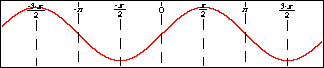
Figure 7.5 shows example views with various label options:
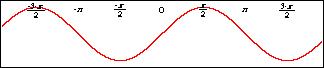
No labels

Labels on the top
Labels on the bottom
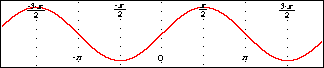
Labels alternating between the top and the bottom
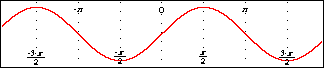
Tick labels alternating between the bottom and the top
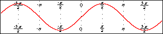
Labels on both the bottom and the top
Figure 7.5: Example views with various label options
- Line pop-up menu
- The line pop-up menu is for changing the style used to display the custom tick lines.
This control affect both polar and cartesian views. Available options include:
- no lines,
- dotted lines,
- dashed lines, and
- solid lines.
Figure 7.6 shows views with various line options:
No lines

Dotted lines
Dashed lines
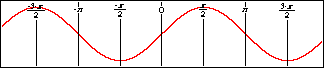
Solid lines
Figure 7.6: Views with various line options
- Symbolic simplification pop-up menu
- The symbolic simplification pop-up menu is for changing
how much simplification is to be applied to the custom tick labels.
This control does not affect polar views.
Available options include:
- none, for no simplication;
- bracketed, for simplified presentation of any parts with brckets; and
- complete, for a simplified presentation.
Figure 7.7 shows views with various symbolic simplification options:
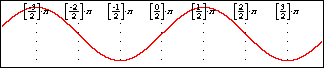
No symbolic simplification
Bracketed symbolic simplification

Complete symbolic simplification
Figure 7.7: Views with various symbolic simplification options
- Label font size pop-up menu
- The label font size pop-up menu is for changing the font size
of the tick line labels.
This control does not affect polar views.
Eight sizes are available, ranging from very small fonts to very large fonts.
- Outline pop-up menu
- The outline pop-up menu is for changing the thickness of any outlining
around displayed custom tick lines and labels.
Outlining is useful when parts of the custom ticks are obscured by graph regions.
This control does not affect polar views.
Available options include:
- no outline,
- minimal outline,
- moderate outline, and
- maximal outline.
Figure 7.8 shows views with various outline options:
No outline
Minimal outline
Moderate outline
Maximal outline
Figure 7.8: Views with various outline options
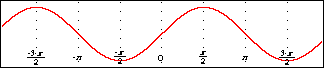
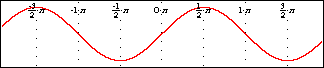
- Display variable pop-up menu
- The display variable pop-up menu is for selecting whether or not
the variable is displayed within tick labels.
This control does not affect polar views.
figure 7.9 shows views with, and without, the variable being displayed:
Variable displayed in labels

Variable not displayed in labels
Figure 7.9: Views with, and without, the variable being displayed
| Hint: | All options in the custom ticks control bar only affect the appearance
of custom ticks in graph view windows. They do not affect
the behaviour or appearance within the custom ticks window itself. |
|
- Custom tick constraint fields
- Custom tick constraint fields are for specifying the custom ticks. They also
display the entered specification in standard mathematics notations.
Prompts appear at the bottom of the field, while a constraint is being entered,
to offer basic tips during the specification process.
Figure 7.10 shows examples simple and complex custom tick specifications:
|
|
|
Simple tick specification
|
Complex tick specification
|
Figure 7.10: Custom ticks windows displaying simple and complex specifications
Custom ticks constraints should be specified in terms of the domain or range variable.
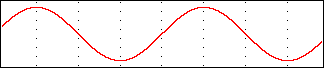
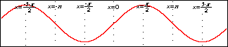
The simple tick specification in figure 7.10 creates vertical ticks in multiples of p,
which is especially useful for graphing trigonometric relations. Additional samples of
useful tick specifications are provided at the end of this manual chapter.
While a constraint is being entered or changed,
- prompts appear at the bottom of its field,
- a blinking cursor is available,
- the Active checkbox of the custom ticks window is unselected, and
- the easy button floating window is available.
Custom ticks constraints are presented in standard mathematics format.
When functions are entered using multiple characters, the characters
are presented in red until the GrafEq recognizes them as a function name.
Red signifies unrecognized entries, and is used here because GrafEq can interpret
“sin” as the sine function instead of the product “s×i×n”
only after an argument, such as x, is entered. The function “sqrt”
is a good example that demonstrates GrafEq formatting functions as they are recognized.
Standard mathematics format is desirable for inclusion in handouts or documents
(by copying from GrafEq and pasting into a word processor).
The presentation also gives some visual feedback that constraints are
interpreted as intended.
Additional constraint fields can be brought up by pressing the tab key.
| Hint: | If the cursor is positioned away from the end of the relation string
during editing, all characters to the right side of the cursor are unformatted. |
|
| Hint: | With default preference settings, unformatted characters are
red in colour displays, and outlined in black-and-white displays. |
|
| Tip: | The Symbol and Times TrueType fonts must be installed
in order to produce attractive screen output, unless default preferences are changed. |
|
| Tip: | More information on the format and structure of constraints and
the parser is available in the How GrafEq Works chapter. |
|
Following are some additional hints and tips about custom ticks and the custom ticks window:
- Custom ticks are usually either domain or range interpretation aids:
For cartesian views, they would be vertical or horizontal lines.
For polar views, they would be radial lines eminating from the origin, or
concentric circles about the origin.
Custom ticks are usually specified in terms of the domain variable or
the range variable. For both cartesian and polar views, custom ticks can
be specified using r or q.
- Each custom ticks window describes one set of custom ticks; the custom ticks can
be defined using a single constraints, or by using multiple constraints.
Additional constraint fields can be brought up
by pressing the tab key from within the custom ticks window.
- Each graph can have one or more sets of custom ticks. Each set is described in its own
custom ticks window. Additional custom ticks windows can be opened
by selecting New Custom Ticks... from the Graph menu.
- The keystrokes field is a strip beneath the current constraint field. It shows the
keystrokes used to produce the formatted relation in the
constraint field. Keystrokes information is especially useful when the intuitive mathematics
symbols and notation do not correspond to general keyboard entries.
Figure 7.11 shows a sample keystrokes field with its corresponding constraint field:
Figure 7.11: A custom ticks window with its keystroke field
Prior to version 2.04, GrafEq always provided this information via the keystroke field.
But as of GrafEq 2.04, keystroke information can be revealed within
the constraint entry fields by positioning the cursor to the left of the entries.
The keystroke field is hidden using the default preferences, but
remains useful for printing purposes.
To display the keystroke field, change the default preference setting.
- A custom tick entry can be completed by selecting the
Active box of its custom ticks window or by pressing return.
When custom tick entries are completed,
the custom tick window will collapse to display just the title bar, parameter bar, ticks
control bar, and
constraint fields - prompts, the blinking cursor, the keystroke field, and the easy button
floating window will disappear. The Active checkbox will be selected, but it can be freely
deselected and selected without editing any constraints.
- Clicking within any constraint field of a completed custom ticks window
will return you to the edit mode and remove the corresponding set of custom ticks
from any opened graph views.
Conclusion
To conclude this chapter of the manual,
following are some examples of useful tick specifications:
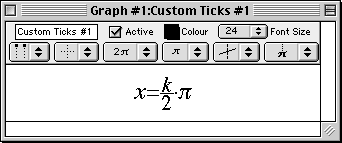
- For a single vertical tick line through (p,3), enter x=p.
- For horizontal tick lines through multiples of 1/2p, enter y=k(p/2).
- For “log-paper”, enter x=10k.
- For “cross-hairs”, enter x=p for tick #1, and y=logp for tick #2.
- For circular ticks, in cartesian views, enter r=k.
- For radial ticks, in polar views, enter q=k(p/6).
| Hint: | Single tick lines or cross-hairs are desirable, especially if memory is low or
only specific regions are of interest. Instead of using custom ticks, adding
constraints such as x=10k; 0<k<4 allows GrafEq
to concentrate on the region of interest and not bother with custom ticks. |
|
Chapter 8. The Page Window
The page window is for preparing pages for printing. Pages can contain
graphs, formulae, text, arrows, and rectangular boxes.
The page window is brought up by selecting New Page from the Graph menu.
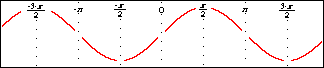
Figure 8.1 shows a page window containing a graph view along and the relation for the graph,
“y=sinx”:
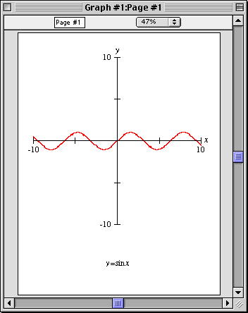
Figure 8.1: A typical page window
The page window consists of the following elements:
- a title bar,
- a parameter bar, and
- a page region.
The elements of the page window are explained as follows:
- Title bar
- The title bar displays the graph title and the page title.
The default page title can be changed using the parameter bar's title edit box.
Figure 8.2 shows the title bar:

Figure 8.2: The title bar of a page window
- Parameter bar
- The parameter bar is for customizing the page title and changing the scaling factor
used to display the page on the screen.
Figure 8.3 shows the parameter bar:

Figure 8.3: The parameter bar of a page window
Following are the elements, from left to right, on the parameter bar:
- Title edit box
- The title edit box is for changing the title of the current page.
Title editing is useful during demonstrations and for print-outs.
The default title, “Page #1”, can be changed
by first clicking on the title edit box to enter the edit mode, and then changing the
title name. The new title will be reflected in all menus, windows, and buttons
that show the page title.
- Page scale pop-up menu
- The page scale pop-up menu is for changing the scaling factor used to display the
page on the screen.
As a default, GrafEq uses the largest scaling factor that can display an entire page without scrolling.
The scale can be changed by clicking on the page scale pop-up menu to bring up a list of
available scale factors, and then selecting from the list.
A small scaling factor can be used for display on a small monitor; A large scaling factor can be used
to magnify the page content for close examination and precise editing.
- Page region
- The page region displays the page being prepared for printing.
The licensee name is always displayed on the top left corner of the page.
The page can also include graphs, formulae, text, pointer arrows, and rectangular boxes.
When a page window is foremost, a page buddy floating window appears to offer
drawing tools, for augmenting the page, and printing tools, for printer control and printing.
| Hint: | The drawing tools of the page buddy are the same as those offered by the view buddy. |
|
Conclusion
To conclude this chapter of the manual,
following are some additional hints and tips about the page window:
- Each page window is associated with, and displays the contents of, one graph only.
The graph can have multiple views, any of which may be included in a page.
- To print separate graphs, separate page windows must be opened.
- Additional page windows may be opened by selecting New Page from the Graph menu.
Chapter 9. The Page Buddy Floating Window
The page buddy window is for accessing drawing tools and printing controls for
its associated page. It appears automatically when a page window is foremost.
Figure 9.1 shows the page buddy floating window:
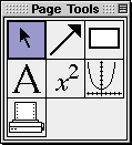
Figure 9.1: The page buddy floating window
The page buddy provides the following general drawing tools:
- a selection tool, for selecting objects;
- an arrow tool, for drawing arrows and lines;
- a box tool, for drawing rectangular boxes;
- a text tool, for adding text annotations; and
- a formula tool, for adding formula annotations.
The page buddy also provides the following unique tools:
- a view tool, for adding views; and
- a printing tool, for selecting, configuring, and using a printer.
Before going into details about the different modes of the page buddy, here are
some hints and general instructions about the floating window and its modes:
- The page buddy floating window appears only when a page window is foremost.
It is otherwise hidden, but returns when a view window is activated.
- Each tool is accessed by clicking on a button in the
page buddy floating window. Controls and options for the selected tool are
presented in an associated, but separate, draw tool floating window.
- The selection tool does not have any options. Therefore, it
does not bring up the draw tool floating window until an object is selected.
- Following are some general instructions:
- Selecting an option’s checkbox activates the option;
clicking on a checkbox or its name toggles between its
selected and unselected states;
- Clicking on a pop-up menu opens the pop-up menu,
so the desired option can be selected from it.
- The colour mode is the initial mode since its options are
useful for optimizing the clarity and readability of graph views.
General Draw Tools
General draw tools provide many elaborate tools for augmenting pages for printing.
Details about each of them are explained in Appendix C, the Draw Tools appendix.
| Hint: | General draw tools in the page buddy is the same as those in the view buddy. |
|
Graph Tools
Graph tools are for pasting selected graph views onto a page.
Figure 9.2 shows the graph draw tool floating window:
Figure 9.2: The Graph Draw Tool Floating Window
The elements, from top to bottom in the graph draw tool floating window,
are explained as follows:
- View pop-up menu
- The view pop-up menu is for selecting a view to the clipboard, for subsequent
pasting to the page.
- Enforce Minimum Size checkbox
- The Enforce Minimum Size checkbox is for toggling between imposing or not imposing
a 25% limit for a pasted graph views’s minumum size.
If the option is not selected, pasted views can be shrunk arbitrarily small.
Print Tools
Print tools are for
Figure 9.3 shows the print draw tool floating window:

Figure 9.3: Printer controls in a draw tool floating window
The elements, from top left across to bottom right in the print draw tool floating window,
are explained as follows:
- Page Setup button
- The Page Setup button is for accessing the operating system’s standard
page setup window. Options for the printer, paper size, source and orientation,
graphic resolution, and number of copies to be printed can then be selected.
- Print button
- The Print button is for accessing the operating system standard
print control window. The print control window is for sending the current print
page to a printer, while it also supports the same options as offered
in the page setup window.
- Show Printer Page checkbox
- The Show Printer Page checkbox is for toggling the display of the limits that
the print head can reach on the physical paper.
- Page size and printer resolution
- The page size displays the print page dimensions in inches; the resolution
displays the resolution in dots-per-inch, “dpi”.
- Reset Guides button
- The Reset Guides button is for changing all margins back to the default setting.
Default margins are set to a minimum, and the guides would overlap with the
printer page.
- Show Guides checkbox
- The Show Guides checkbox is for toggling the outlining, with dotted line,
of the page area on which page contents are to be printed.
- Pop-up menus for Left, Right, Top and Bottom Guides
- The guide pop-up menus are for changing the respective print margins.
| Hint: | Margins can also be set by clicking at the respective guide box on the page, then
dragging it to the desired position. |
|
Chapter 10. The Menu Bar
The menu bar is for accessing functionalities provided in the pulldown menus.
It is located just below the GrafEq window title bar, and is always present.
The menu bar can contain the following elements:
- File menu,
- Edit menu,
- Graph menu,
- Relation menu, and
- Custom Ticks menu.
| Hint: | File and Edit menus are always present; but
- Graph menu is present only when there is one or more active graphs;
- Relation menu is present only when an algebraic window or structural window is foremost; and
- Custom Ticks menu is present only when a custom ticks window is foremost.
|
|
File Menu
The File menu is divided into six groups:
“opening and creating”,
“configuring”,
“closing and saving”,
“printing”,
“selecting”, and
“terminating”.
Figure 10.1 following is the file menu:

Figure 10.1: The File menu
- Opening and creating
- New Graph creates a new graph, and brings up a new algebraic window for the
new graph’s first relation. The new graph will be assigned a new title, using a
new sequence number.
- Open... lets you open a saved graph from disk.
Preference files may also be opened, although a few preferences (such as interface language)
only apply at startup.
- Configuring
- Preferences brings up the preferences window, which
is for setting up the GrafEq environment for current
and/or future sessions. Many elaborate controls are accessible
from the File Preferences menu; for details, refer to the Preferences chapter.
- Register... lets you register your copy of GrafEq. This menu option is not
present in physically licensed copies of GrafEq.
- Closing and saving
- Close Graph closes all windows associated with the foremost graph.
- Close Window closes the foremost window.
- Save Graph stores the current graph or view to disk.
GrafEq supports three file formats, as explained following:
- Full Graph - all information, of the chosen graph, including relations, views,
pages, ticks, and the current plotting state is saved.
A full graph can later be opened in the exact same state as when
it was saved. Partially plotted graphs can be refined from where it was
left off.
Full graphs can use a significant amount of disk space.
- Skeleton Graph - all information, of the chosen graph, excluding the current plotting state, but including
relations, views, pages, and ticks of the foremost graph is saved.
When a skeleton graph is re-opened, graph plotting will start over, because
the skeleton file format does not save the plotting state.
Skeleton graphs use very little disk space.
- Simple View - only the chosen graph view is saved.
With Windows, it is saved using the WMF format.
With a Macintosh computer, it is saved using the PICT format.
Simple view files can only be re-opened in GrafEq as a picture.
However, the may also be opened, and modified, in painting and
drawing programs.
- Save Preferences saves the current preferences.
- Save Graph As... lets you save a graph or view to a new file. Other than letting
you choose a new name and location for the file, Save As... is identical
to Save.
- Save Preferences As... lets you save the preferences to a new file.
GrafEq looks for a preference file named “GrafEq Preferences” at startup,
which is the default name used for saved preferences.
- Printing
- Page Setup... opens the operating system’s standard
page setup window. Options may include the paper size, paper source and orientation,
printign resolution, and the number of copies to be printed.
- Print... opens the operating system’s standard
print window. The print window is used for sending a
page to an available printer.
The print window may also include some options that influence the printnig process.
| Hint: | GrafEq supports printing via the creation of pages which can be invoked by
selecting New Page from the Graph menu. For details, refer to the Page Window chapter. |
|
- Selecting
Selection controls provide access to all open graphs. Each is listed using its
current title. Selecting a graph causes it to becomes the current graph,
and bring its first algebraic relation window to the front.
- Terminating
- Halt Graphing stops graph plotting in all open views.
- Quit closes the current GrafEq session.
Edit Menu
The Edit menu is for accessing Cut, Copy and Paste operators, as explained following:
- Cut removes the selected content from its current location, and
keeps a copy on the clipboard.
- Copy copies of the selected content to the clipboard.
- Paste inserts the clipboard’s contents into the current position.
If some content is selected (and there is no current position),
the selection is replaced with the clipboard’s contents.
Editing is typically used on algebraic relations and general text within GrafEq.
GrafEq’s formatted relations and plotted graph views can also be copied and pasted
to wordprocessor, drawing, and other application programs.
However, editing options are not available in the following situations:
- When the view window is foremost:
- the Cut and Paste operators are greyed out (unavailable),
because the view window does not allow changes to it; the view window
displays graph views and the plotting process.
- the Copy operation is supported, because the contents
of the view region can be copied, and then pasted to other applications.
- When the page window is foremost, the entire Edit menu is greyed out (unavailable),
editing in the page window is provided via the page buddy floating window.
- When the structural relation window is foremost, the entire Edit menu is greyed
out (unavailable), because the structural window does not allow changes to it;
the structural window displays the tree structure of its associated relations.
| Tip: | A few more tips when pasting GrafEq entities with the editing controls to
wordprocessor, or other application programs are listed as follows:
- To fine-tune alignment when pasting to a wordprocessor,
try the word processor’s superscript of subscript effects.
- To achieve best results when printing a document containing
a GrafEq graph, try changing options within the Page Setup or
Print of the program used.
- It is possible to first paste a GrafEq entity into a drawing program,
to use its more powerful drawing features, and then copy the new picture
from the drawing program to the destination
application. (GrafEq does supports basic drawing effects.)
|
|
Graph Menu
The Graph menu is for creating, and displaying, graph elements.
- Creating elements
- Creation controls are for creating new relations, views, custom ticks, and pages.
- New Relation creates an algebraic relation window for entering a new
relation.
- New View... opens the create view dialog box, from which
a graph view can be created.
- New Custom Ticks creates a custom ticks window for specifying a new
set of custom ticks.
- New Page creates a page window for preparing a page for printing.
- Displaying elements
- Display controls provide access to all open relations, views, custom ticks, and pages;
each listed with its respective title. The window for the selected item becomes
the foremost window.
Relation Menu
The Relation menu is for toggling the display of the algebraic relation window,
the structural relation window, and the easy buttons floating window. While the display options
for the algebraic and structural windows are associated with the active relation only,
the option for the easy button floating window is global and applies to the
current GrafEq session.
Custom Ticks Menu
The Custom Ticks menu is for toggling the display of the easy buttons floating window.
The display option for the easy button floating window is global and applies to the
current GrafEq session.
| Hint: | The display option for the easy button floating window is
equivalent to, and synchronized with the one available from the relation menu.
Change in one of them will be reflected in the other. |
|
Chapter 11. Preferences
Preferences are for setting defaults for some GrafEq features, behaviour and
appearances. Some advanced features are also controlled only from within preference windows.
Preference windows are accessible by selecting Preferences from the File menu.
Figure 11.1 shows the preference window as it appears by factory default:
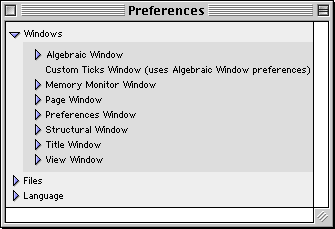
Figure 11.1: The GrafEq preferences window
GrafEq preferences are organized mainly by windows; other general preference for file access
control and interface languages are also provided.
Before going into details about the preferences, following are some general hints
about the effects preference settings and some general use instructions:
- Most preference settings take effect immediately; some take full effect only in
subsequent sessions, but full preference changes can be activated immediately
by quitting and restarting GrafEq.
- Default means that the settings will apply to all appropriate cases,
and across sessions, every time GrafEq is started.
These settings can be changed ‘on the fly’, while GrafEq is running, but the changes
will apply only to individual graphs or windows, and will
not affect the defaults. The next time GrafEq is started, default settings
would be back in effect.
- Selecting an option’s checkbox activates the option;
clicking on a checkbox or the checkbox’s name toggles between its
selected and unselected states;
- Clicking on a pop-up menu brings up its pop-up list or table,
so the desired option can be selected from it.
- Many preference controls are offered in lists. Lists are expandable, as explained
following:
- Lists can be expanded by clicking on the
triangular arrow adjacent to, or the name of, the respective list.
- Expanded lists reveal the respective list elements and/or sub-lists.
List elements revealed can then be selected individually; and sub-lists can
then be further expanded. The same list rules apply to sub-lists.
- Some lists also come with checkboxes adjacent to their
respective triangular arrows. The list box can be selected to conveniently
select all elements of the list.
Fully selected lists have check marks in their checkboxes;
partially selected lists have horizontal bars in their checkboxes;
fully unselected lists have blank checkboxes.
Windows Preferences
Windows are listed in alphabetical order of window names, as seen in figure 11.1 earlier.
Algebraic Window Preferences
(Custom Ticks Window uses the same preference settings as the algebraic window.)
Controls cover the clipboard, easy buttons, display fields, and the teleprompter.
Figure 11.2 shows algebraic window preferences:
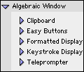
Figure 11.2: Algebraic window preferences
- Algebraic Window - Clipboard
Clipboard Preferences are for setting appearances and
formats to be used when exporting from GrafEq’s algebraic windows
to the clipboard. Figure 11.3 shows clipboard preferences:
Figure 11.3: Algebraic window clipboard preferences
- Add padding space around equation checkbox
Select the option if it enhances layout appearance when relations are pasted
to a wordprocessing document.
- Export to clipboard as... format pop-up menu
Select some text to export a relation in simple ASCII characters only;
select a picture to export it exactly as it appears in the algebraic window; and
select some text and a picture to include both text and picture information.
- Use ... bitmap in place of a picture checkbox and resolution pop-up menu box
Select bitmap and select low resolutions to save memory and disk space;
select high resolutions for smoother and clearer bitmaps.
- Include formatting details in text clip checkbox
- Algebraic Window - Easy Buttons
Easy buttons preferences are for setting defaults to show, or not show,
the easy button floating window; and setting access to each easy button group.
Figure 11.4 shows easy buttons preferences:
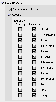
Figure 11.4: Algebraic window easy buttons preferences
- Show easy buttons checkbox
- Access
- Expand on Startup checkbox and Available checkbox for each easy button group.
Select Available to display the heading of the respective easy button group;
select Expand on Startup to display the heading as well as individual easy buttons of the
respective easy button group.
By factory default, the Roman characters and numbers group are unavailable
because they are already available from the standard keyboard. Refer to
to Appendix A, the Easy Buttons appendix for details of easy buttons.
- Algebraic Window - Formatted Display
Formatted display preferences are for setting font type, default font size, and
appearances of entries in the algebraic window’s
constraint field(s).
Figure 11.5 shows formatted display preferences:
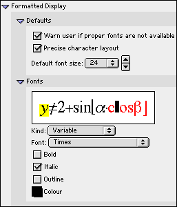
Figure 11.5: Algebraic window formatted display preferences
- Defaults:
- On startup, warn user if proper fonts are not available checkbox
- Precise character layout checkbox
- Default font size... pop-up menu, with up and down arrow buttons
The up arrow button is for stepwise size increment, and the
down arrow button is for stepwise size decrement.
- Fonts
- Effects sample - This area displays the effects of the current
font options set under this manual section.
The highlighted character(s) represents the currently selected
character kind. The appearance of these highlighted characters
and the font settings currently displayed correspond with each other.
The kind of characters highlighted is synchronized with the selection
displayed in the character kind pop-up menu, and
can be changed by either clicking within the effects sample box,
or from the character kind pop-up menu. The character kind pop-up menu
is described next.
- Character Kind pop-up menu - The pop-up menu lists
formatted character kinds (entries to the left side of the mouse cursor) first,
then a separator line, and finally unformatted character kinds (entries to
the left side of the mouse cursor).
- Font setting controls include:
- a Font pop-up menu,
- a Bold checkbox,
- a Italic checkbox,
- a Outline checkbox, and
- a Colour pop-up menu.
Any font setting changes made will apply only to the currently selected
character kind, as highlighted in the effects sample box, and indicated
in the character kind pop-up menu.
| Hint: |
- The highlighted character kind in the sample box and
the current option in the kind pop-up menu are synchronized.
- The format and appearances of the highlighted characters are
synchronized with font type, boldface, italic and outline type, and
colour settings selected/displayed.
- Any changes in the font options takes immediate effect in the sample box.
- Symbol character kinds, for both formatted and
unformatted sections, should use symbol font only.
- Experiment with the various options and see the effects.
|
|
- Algebraic Window - Keystroke Display
| Hint: | As of GrafEq version 2.04, keystroke information is available directly from
the constraint entry fields, by positioning the cursor to the left of the entries.
The keystroke field remains useful for printing purposes, but
has been set to be hidden by factory default. |
|
Keystroke display preferences is for setting to show, or not show the keystroke field,
and setting font type, and appearances of entries in the keystroke field.
Figure 11.6 shows keystroke display preferences:

Figure 11.6: Algebraic window keystroke display preferences
- Show keystroke line checkbox
- Fonts
These fonts preferences are essentially the same as that for the formatted display,
they apply to entries to the algebraic window’s keystroke display field.
- Algebraic Window - Teleprompter
The teleprompter preference is for toggling to show, or not show,
teleprompter (which is the user hint shown at the bottom of an active constraint or
custom tick specification field). There is just one preference option, which is provided
by the Show teleprompter checkbox.
Figure 11.7 shows the teleprompter preference:
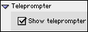
Figure 11.7: Algebraic window teleprompter preferences
Memory Monitor Window Preferences
Memory monitor preferences are for setting defaults to show, or not show,
the memory monitor, setting its optional data contents, and setting formats and
appearances for the memory monitor window.
Figure 11.8 shows memory monitor window preferences:
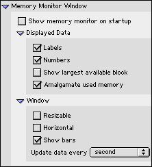
Figure 11.8: Memory monitor window preferences
- Show memory monitor on startup checkbox
Deselect this option if memory is scarce. The memory monitor can always
be brought up instantly while GrafEq is running, by selecting
Memory Monitor from the help menu.
- Displayed Data options list:
- Labels checkbox
- Numbers checkbox - Exact quantities of memory,
in Bytes, KBytes, or MBytes can be displayed, in
addition to percentages for data items.
- Show largest available block checkbox
- Amalgamate used memory checkbox
- Window appearance options list:
- Resizable window checkbox
- Horizontal window checkbox - If unselected, vertical window would be used.
- Show bars checkbox - If selected, proportional bars will be used
to present data items, in addition to percentages, and numbers.
- Update data every... time interval pop-up menu
Page Window Preferences
Page window preferences are for setting the frequency at which page window contents
are to be updated from any graph views, and setting font size for the page window to suit
printing needs. Figure 11.9 shows page window preferences:

Figure 11.9: Page window preferences
- Updates preference is provided
by the Update from view window every... time interval pop-up menu.
- Decoration preference is provided by the default font size pop-up menu.
| Hint: | The page window would flash every time it is updated; the advantage of showing
current contents is to be weighted against blinking or flashing of the display. |
|
Preferences Window Preferences
Preferences window preferences are for restricting access to preferences settings, and
saving of preference changes.
Figure 11.10 shows preferences window preferences:
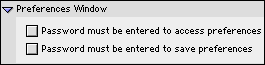
Figure 11.10: Preferences window preferences
- Need password to access preferences checkbox
- Need password to save preferences checkbox
| Hint: | The same password will be used for controlling access to preference settings and
saving, as well as access to file loading and saving. A user specific password
is supplied with registration. |
|
Structural Window Preference
The structural window preference is for setting defaults to
present commutative relations either as flat tree structures, or as full-blown trees.
The control is provided by the Combine commutative checkbox.
Figure 11.11 shows structural window preference:
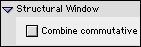
Figure 11.11: Structural window preference
Title Window Preference
One simple control is offered for the title window,
by the Minimum number of available colours to justify using colour... number pop-up menu.
Figure 11.12 shows title window preference:
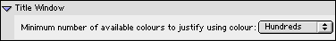
Figure 11.12: Title window preferences
View Window Preferences
Controls cover the clipboard, view colours, information, ticks, view and zoom.
Figure 11.13 shows view window preferences:
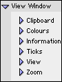
Figure 11.13: View window preferences
Files Preferences
Files preferences are for controlling access to file loading and saving, by the
Password required for opening files checkbox and
Password required for saving files checkbox.
| Hint: | The same password will be used for controlling access to preference settings and
saving, as well as access to file loading and saving. A user specific password
is supplied with registration. |
|
Language Preference
Language preference is for changing the interface language,
by clicking on the American English radio button or
the Canadian English radio button.
Conclusion
To conclude this chapter of the manual, remember that
default preference means that the settings will apply to all appropriate cases,
and across sessions, every time GrafEq is started.
These settings can be changed on the fly, when GrafEq is running, but the changes
will apply only to individual graphs or windows, and will
not affect the defaults. The next time GrafEq is started, default settings
would be back in effect.
Chapter 12. How GrafEq Works
The general GrafEq environment is that
relations are entered in algebraic windows, and plotted in view windows. Then relations and
views can be prepared for printing in page windows.
GrafEq also has many features of interest to the sophisticated user, including
its relation parser, plotting technique, and memory management.
| Hint: | Useful and interesting hints and tips relevant to the immediate topic are
offered throughout this GrafEq manual. Most chapters are also concluded with
general hints and tips for the chapter topic. |
|
The Algebraic Relation Parser
GrafEq’s algebraic relation parser understands conventional
mathematics notation, which helps make the program intuitive to those familiar with such notation,
and encourages students to learn the standad notation.
Some characteristics are explained as follows:
- A relation can contain one or more constraints. Each constraint
must be a valid relation. The graph of a relation given by multiple constraints
is the intersection of the graphs given by the constraints taken individually.
This interpretation can be further understood by opening a structural relation window.
- A relation can be an equation, an inequality, a set description, or a
conditional or piecewise definition.
- A relation can be explicit or implicit:
- explicit if one of its variables is isolated on one side of the relation definition;
- implicit if neither of its variables is isolated.
- Conditional or piecewise descriptions are entered as follows:
y<{ x if x2+y2>=5,
sinx if (-1<x<2p),
-5 if x ∈ {8, 18, 28, 38} }
- Relations may be given using set notation, as follows:
a<{b,c}, which is interpreted as the union of a<b and a<c.
GrafEq does not use a type-system, so that x={1,2} is the same as x∈{1,2}.
- Relation definitions must be in a valid form: for example; braces, brackets, and
parenthesies must be properly closed.
| Tip: | Older versions of GrafEq perform little symbolic
manipulation, and plotting is primarily numeric.
Natural pre-processing of expressions such as replacing
“x3 - x3”
with a simple “0” might enhance efficiency significantly.
Starting with version 2.04, GrafEq does simple pre-processing,
so that it will recognize (and perform) simple replacements that
improve graphing speed without changing the graph of the relation.
Rewriting and simplifying relations must be done very carefully!
For example, “>=!” should not be re-written as “<” because
they are not equivalent in all cases. Figure 12.1 shows
the graphs of “y >=! Arccosx” and “y < Arccosx”
as plotted by GrafEq; they are not equal because Arccosx is undefined for
x>1 and x<-1:
 |
 |
| Graph of y >=! Arccosx |
Graph of y < Arccosx |
Figure 12.1: Graphs plotted by GrafEq shows that “>=!” and “<” are not the same
|
|
The Plotting Technique - Successive Refinement
GrafEq’s graphing engine uses a unique plotting technique called
successive refinement, which ensures that irregular graphs
are plotted correctly. Details are explained as follows:
- A view region is divided into rectangular sub-regions.
- Each sub-region is examined:
- if GrafEq can prove that the sub-region does not contain any
solutions that satisfy any of the active relations, the sub-region does not form
part of the final graph, and it is removed from the graph;
- if GrafEq can prove that all points within the entire sub-region does
satisfy an active relation, the entire sub-region forms part of the final graph,
and is never looked at again;
- if the sub-region lies within a single pixel and GrafEq can prove that a point
within the sub-region does
satisfy an active relation, the sub-region forms part of the final graph,
and is never looked at again;
- if GrafEq cannot prove one of the above three propositions,
the sub-region is further examined:
- if the sub-region cannot be further subdivided
- because it has become so
small that the current number system cannot represent
the required numbers, then GrafEq will state that
“precision is exhausted”,
- because it has become too small relative to the size of a pixel,
then GrafEq will state that
“subdivisions are exhausted”;
- otherwise, the sub-region will be further subdivided, and
each smaller sub-region will be examined just like its predecessor, as
explained above.
| Hint: | A graph is drawn using the following rules:
- pixels that form part of the final graph have the (possibly blended) colours of the relevant relations;
- pixels that do not form part of the final graph have the
colour of the view region’s background; and
- pixels that are not yet determined
- have the (possibly blended) colours of the relevant relations, or
- if the Show Work option, in the information view buddy, is selected,
the colour of the work area.
|
|
| Hint: | GrafEq can correctly plot irregular graphs such as singularities and
narrowly spiked curves.
Figure 12.2 shows three stages in the plotting of
“x(x+1)2+y(y+1)2=0”:
Figure 12.2: GrafEq plotting a relation with a singularity, in successive refinement
|
|
| Tip: | Graphing can be sped up if relations can be described as inequalities naturally.
Inequalities are typically done more efficiently than equations.
|
|
| Hint: | GrafEq displays a “signature” at point-discontinuities.
Consider the relation y=(x-1)(x+1)/(x-1).
Its graph can be anticipated to be the line y=x+1 less the point (1,2).
However, when the relation is fed to a computer, while graphers using common sampling
plotting techniques would likely miss the issue of the point discontinuity altogether,
even GrafEq with its robust graphing engine cannot omit any pixels for the
point (1,2), because the pixel containing (1,2) also contain many
solutions in the real number continuum that satisfy the relation. In such cases,
rather than just graphing the solid line y=x+1,
GrafEq will often make the abnormaly apparent, by displaying a signature at the
point-discontinuity, as shown in figure 12.3:
Figure 12.3: Graph with point discontinuity signature at x=1
Starting with version 2.04, GrafEq has an improved graphing engine which may not display discontinuity
signatures (older versions may not either; the signature is a side-effect of the graphing process).
Future versions will have added features, which will allow users to see undefined portions of a graph.
|
|
| Tip: | To achieve high precision, the view scope can be enlarged by setting large bounds
from the create view dialog box. High precision is useful for printing
very thin accurate curves via a high resolution printer.
In general, a 600 to 2,450 dpi printer will generate good results with uniform ticks.
|
|
Memory and Speed
GrafEq provides a memory monitor to display information on memory usage.
When the memory monitor shows that memory resources are becoming inadequate,
the following actions might help:
- Quit any screen savers and applications that are opened but currently non-essential.
- Close any windows that are currently non-essential.
- Turn off the “Keep this view after zooming” option in the Zoom View Buddy.
- Turn off graph ticks wherever possible and appropriate.
- Set view windows and view scopes as small as possible.
- Keep the number of active plotting views to a minimum, just one if possible.
- If plotting additional relations in a view window, set other relations to inactive.
- Set all colours or patterns to solid black wherever appropriate.
More memory usage information is also provided in the Information View Buddy, including:
- the memory being used by each view and each relation;
- the time spent exclusively for graphing versus the
total time elapsed, because the computer also spends time in re-drawing windows,
and monitoring external events such as mouse clicks, key presses.
Speed of graph plotting can be enhanced by the following steps:
- preprocess the relation, such as replacing “x2-x*x”
with “0”;
- use same colour output instead of black and white patterns;
- use solid black instead of patterns or colours during plotting - patterns and
colours can be reset after plotting is completed.
| Tip: | Any computationally intensive program will
run more efficiently on a fast machine with generous memory resources.
For specific information on how a computer system manages memory,
refer to documentations for its hardware, operating system and other softwares installed.
With respect to GrafEq:
If computer time is restricted, such as access to machines
is limited to one-hour time slots, GrafEq can still be used effectively to plot
complicated graphs at high resolutions. At the end of a session, select halt graphing
from the File menu, and save the graph in full format. The full graph can be
opened at a later time and graphing can resume from where it left off previously.
If disk resources is too scarse for saving a full graph, a graph of interest
can usually still be saved in the skeleton format. The skeleton graph can
be opened at a later time, although the plotting process must then re-start from
scratch.
|
|
Further Reading
For alot more information on how the graphing process works, see:
Jeffrey Allen Tupper. Graphing Equations with Generalized Interval Arithmetic.
M.Sc. Thesis, Department of Computer Science, University of Toronto, January 1996.
http://www.dgp.toronto.edu/people/mooncake/msc.html
Appendix A. Easy Buttons
Easy buttons are provided in an easy button floating window.
For details of the floating window, refer to the Easy Button Floating Window chapter.
Operations, functions and symbols provided by the easy buttons require certain formats,
and take varying number of arguments. Most entries are mathematically
intuitive. Relation editing windows also provide hints at the bottom of the window
view to prompt for the next step of action.
Algebra Easy Buttons
The Algebra easy buttons provides help for entering algebraic functions.
The two control buttons on the top row offer options for
algebraic power functions, or inverse algebraic power functions.
Figure A.1 shows the algebraic easy buttons:
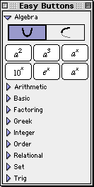 |
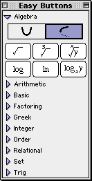 |
| Power Functions |
Inverse Power Functions |
|
Figure A.1: Algebra Easy Buttons
The entities x and y within the easy buttons represent
expressions that should be entered after the button-click;
and the entity a represents arguments that should be entered prior
to the button-click. Each button is explained as follows:
- For the a2, and a3 buttons, enter an
argument first; then click the button;
- For the 10x, and ex buttons, click the button first;
then enter the power expression (represented by x). The effects can be observed in
the relation visual format, the relation tree structure, and the relation graph.
For example, to enter “e33.54”,
- click the ex button;
- enter the power expression represented by x, which is “33.54”
in this example.
Hint: Parentheses would be necessary for power terms such as x/y, or 2xy,
but not if the power is a single simple term.
Experiment with GrafEq to see the differences when these power terms
are entered with, and without parentheses.
- For the ax button, enter the argument first; then
click the button; then enter the power index expression (represented by x).
For example, to enter “x2+y3=52xy”,
- enter “x”;
- click the a2 button;
- enter “+y”;
- click the a3 button;
- enter “=5”;
- click the ax button; and
- enter the expression “(2xy)”.
Hint: The same parenthesis rules apply to ax, 10x, and
ex, which means that parentheses are necessary for power terms such as x/y, or 2xy,
but not for single simple terms. Experiment!
- For the square-root, log, and ln buttons,
click the button first; then enter an argument, which can be
a single simple term or a complex term enclosed in appropriate parenthesis.
- For the cube-root button,
click the button first; then enter the argument and
finish the term with a closing parenthesis.
- For the xth-rooty button,
click the button first; then enter the
root index expression (represented by x) follow by
a comma; then enter an argument expression (represented by y); and
finally finish the term with a closing parenthesis.
For example, to enter “5th root of 2x+y”,
- click the xth-rooty button;
- enter the root index expression represented by x, which is “5” in this
example,
- follow by a comma;
- enter the argument expression represented by y, which is “2x+y” in this
example,
- finish term with a closing parenthesis.
- For the logxy button, click the button first; then enter an
expression for the log base (represented by x); followed by
the argument expression (represented by y).
For example, to enter “log2x”,
- click the logxy button;
- enter the logarithm base represented by x, which is “2” in this example;
- enter the argument represented by y, which is “x” in this
example.
Hint: Parentheses are not required if the base and the argument are single
simple terms or fractions of single simple terms, such as x, y, x/y, 2, 3, or 2/3.
Parentheses are necessary for terms such as x+y, 2xy, or for
two consecutive numeric terms that would otherwise be treated as one number.
Try it out!!
Hint: In general, exiting exponent, radical, or logarithmic base is
by entering an operation of lower precedence; or if the constraint specification
is already complete, by pressing
return to graph the relation, or pressing the tab key
to enter a new relation constraint.
More information about precedence is available in
Appendix B, the Functions and Relations appendix.
Arithmetic Easy Buttons
The Arithmetic easy buttons, as seen in figure A.2, provides help for
entering arithmetic operators.
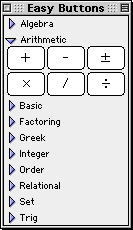
Figure A.2: Arithmetic Easy Buttons
The *, -, and / are all infix binary operators (used in between
two arguments), while +, -, ± can be either infix binary, or prefix
unary (used in front of one argument, which can be a single term or a complex term
enclosed in appropriate parentheses).
Basic Easy Buttons
The Basic easy buttons, as seen in figure A.3, provides help for
entering some frequently used mathematical
operations and symbols which are not obviously available from basic keyboard keys.
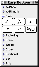
Figure A.3: Basic Easy Buttons
Factoring Easy Buttons
The Factoring easy buttons, as seen in figure A.4, provides help for
entering factoring functions and operators.
Figure A.4: Factoring Easy Buttons
- For mod, lcm,
gcd, and gamma,
click the button, then enter arguments.
Gamma takes one argument, which can be a
single term or a complex term enclosed in appropriate parentheses.
Mod takes two arguments while lcm and gcd takes two or more,
each separated by a comma, and the last one followed by a closing parenthesis.
- For !, enter an argument first, then click the button.
The single argument can be a single term or a complex term enclosed in appropriate parentheses.
Greek Easy Buttons
The Greek easy buttons provides help for entering Greek characters.
The two control buttons on the top row offer options for upper or lower case Greek characters.
The three control buttons on the second row offer options for
characters groups denoted by the leading characters, namely:
set A(from A to I), set J(from J to R), or,
set S(from S to Z); and
set a(from a to i), set j(from j to r), or,
set s(from s to z).
Figure A.5 shows the Greek easy buttons:
 |
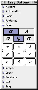 |
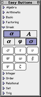 |
| Set a |
Set j |
Set s |
|
 |
 |
 |
| Set A |
Set J |
Set S |
|
Figure A.5: Greek Easy Buttons - Lower and Uppercase Characters
Integer Easy Buttons
The integer easy buttons, as seen in figure A.6, provides help for
entering integer functions and operators.

Figure A.6: Integer Easy Buttons
- For both floor and ceiling operations, click the opening button,
then enter the argument, then click the closing button.
The single argument can be a single term or a complex term enclosed in appropriate parentheses.
- For round, and trunc,
click the button first, then enter an arguments.
The single argument can be a single term or a complex term enclosed in appropriate parentheses.
Measure Easy Buttons
The Measure easy buttons, as seen in figure A.7, provides help for
entering magnitude operators.
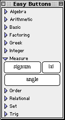
Figure A.7: Measure Easy Buttons
- For |x|, click the button first, then enter an arguments,
which can be a
single term or a complex term enclosed in appropriate parentheses, then close
by clicking the button again.
- For signum, click the button first, then enter an arguments,
which can be a
single term or a complex term enclosed in appropriate parentheses.
- For angle, click the button first, then enter an arguments,
which can be a
single term or a complex term enclosed in appropriate parentheses.
Numbers Easy Buttons
The Numbers easy buttons, as seen in figure A.8, provides help for
entering numeric digits, the decimal point, and the negative sign.
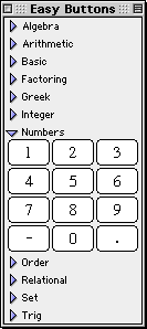
Figure A.8: Numbers Easy Buttons
Numbers can be conveniently entered via the computer keyboard; this easy button set is
provided for completeness, and is turned off in preferences settings by factory default.
Order Easy Buttons
The Order easy buttons, as seen in figure A.9, provides help for entering maximum
and minimum ordering functions:
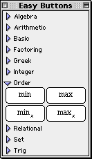
Figure A.9: Order Easy Buttons
- Click the ordering buttons first, then enter arguments.
- Min and max return the
minimum and maximum respectively, of specified arguments,
and minx and maxx return the xth smallest and
the xth largest respectively, of specified arguments.
- Min and max each takes two or more arguments,
each separated by a comma, and the last one followed by a closing parenthesis.
- For minx and maxx, enter a positive integer base first,
then enter an appropriate number of arguments,
each separated by a comma, and the last one followed by a closing parenthesis.
Hint: The number of argument should be equal to or larger than the value of x.
Relational Easy Buttons
The Relational easy buttons provides help for entering relational symbols.
The two control buttons on the top row offer options for
simple relational symbols, or negated relational symbols.
Figure A.10 shows the relation easy buttons:
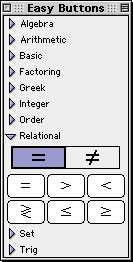 |
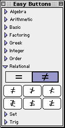 |
| Direct Relations |
Negated Relations |
|
Figure A.10: Relational Easy Buttons
All relational symbols are infix binary operators(used between two arguments).
Roman Easy Buttons
The Roman easy buttons provides help for entering Roman characters.
The two control buttons on the top row offer options for upper or lower case Roman characters.
The three control buttons on the second row offer options for
characters groups denoted by the leading characters, namely,
set A(from A to I), set J(from J to R), or, set S(from S to Z).
Figure A.11 shows the Roman easy buttons:
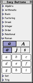 |
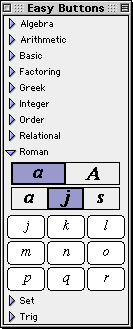 |
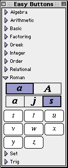 |
| Set a |
Set j |
Set s |
|
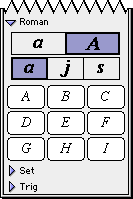 |
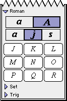 |
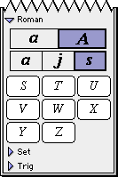 |
| Set A |
Set J |
Set S |
|
Figure A.11: Roman Easy Buttons - Lower and Uppercase Characters
Roman characters can be conveniently
entered via the computer keyboard; this easy button set is
provided for completeness, and is turned off in preferences settings by factory default.
Set Easy Buttons
The Set easy buttons, as seen in figure A.12, provides help for
entering set symbols.
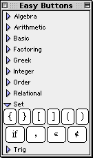
Figure A.12: Set Easy Buttons
- For braces, brackets, and parentheses,
click the opening button,
then enter argument(s), then click the closing button to finish.
- Pairs of braces, brackets, and parentheses can all be used to control precedence.
- Pairs of braces can also be used to enclose set elements (with a comma separating
every two successive set elements).
- “If” is used within braces for conditional definition, with one or more
sets of a value term followed by if, then the condition.
“If” should be preceded a space, and followed by a space.
A typical example is y={x if x>0, 0 if x=0, -x if x<0}
- “is member” and “is not member” are
for set membership definition.
- “,” is required for separating elements or arguments.
Trig Easy Buttons
The Trig easy buttons provides help for entering various trig functions and relations.
The three control buttons on the top row offer options for
simple trig functions, inverse trig functions, or inverse trig relations.
The four control buttons on the second row offer options for
operations groups based on four different conics, namely,
circle set,
hyperbola set,
square set, or
diamond sets.
Figure A.13 shows the trig easy buttons:
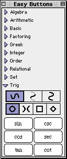 |
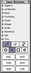 |
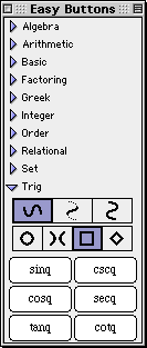 |
 |
| Circle Functions |
Hyperbola Functions |
Square Functions |
Diamond Functions |
|
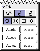 |
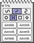 |
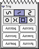 |
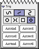 |
| Inverse |
Inverse |
Inverse |
Inverse |
| Circle Functions |
Hyperbola Functions |
Square Functions |
Diamond Functions |
|
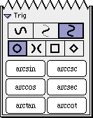 |
 |
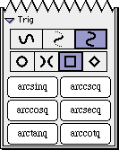 |
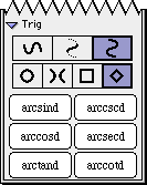 |
| Inverse |
Inverse |
Inverse |
Inverse |
| Circle Relations |
Hyperbola Relations |
Square Relations |
Diamond Relations |
|
Figure A.13: Trig Easy Buttons
All trig operators are prefix binary, to be used in front of one argument which can be
a single simple term or a complex term enclosed in appropriate parenthesis.
To conclude this section of the manual,
following are some additional hints and tips about the easy button floating window:
- The display of each group of easy buttons in the floating window can be toggled
on or off by clicking the
triangular arrow adjacent to the corresponding set name.
- Easy button groups altogether with the respective headings can be hidden from
the easy button floating window, across sessions, by unselecting the respective
“Available” checkboxes from the File
Preferences
's Windows - Algebraic Window - Easy Buttons - Access menu.
By factory default, all but Measure, Numbers, and Roman buttons are selected, but a
smaller selection may be appropriate for a beginners’ class or a special lesson.
- All functions, operations and symbols may also be entered via the keyboard.
The key-combinations for special characters and operators are listed in
Appendix E, the Keyboard Shortcuts appendix.
Appendix B. Functions and Relations
Algebraic Functions
- Exponentiation includes a2, a3, and
the complete range of simple and
complex power functions. Each takes one base term, and one power term.
| Hint: | Besides easy buttons, entry of exponentiation can also be initiated by pressing
the up arrow key or the caret key. |
|
- Radical includes sqrt, root(3,x), and the complete range of
simple and complex root functions. Each takes one root index term, and one radical term.
- Logarithm includes log (for base 10), lg (for base 2),
ln (for natural logarithm
or base e), and the complete range of simple and complex logarithm functions.
Each takes one base term, and argument term.
| Hint: | Besides easy buttons, entry of logarithm base can also be initiated by pressing
the down arrow key. |
|
Arithmetic Operations
- Addition (+), Subtraction (-), and Add-and/or-Subtract (±) can
be either infix binary with the operator in between two argument terms,
or prefix unary with the operator in front of one argument term.
Hint:
Besides the easy button, the ± symbol can be entered with the
control-+ key combination.
- Multiplication (*) and Division (/ or ÷) are infix binary.
Hint:
Besides the easy button, the ÷ symbol can be entered with the
control-/ key combination.
Factoring Functions
- Modulo (mod) takes two argument terms, and returns the positive remainder of
the division of the first argument term by the second argument term.
- Least Common Multiple (lcm) and
Greatest Common Divisor (gcd) each
takes two or more argument terms, and are generalized to real valued arguments.
- Gamma (gamma) function is a continuous extension of the factorial function. For any
non-negative integer x, gamma(x+1) is equal to x!.
- Factorial (!) is postfix unary with the operator
following one argument term.
It is a recursively defined function: for any non-negative integer x,
(x+1)! returns (x+1)x!, and 0! returns 1.
Integer Functions
Integer functions convert real values to intergers. Each function takes one argument.
- Floor (⌊x⌋) returns the closest integer smaller than or
equal to the argument value.
| Hint: | Besides the easy buttons, the floor symbols can be entered with the
control-[ and control-] key combinations. |
|
- Ceiling (⌈x⌉) returns the closest integer larger than or
equal to the argument value.
| Hint: | Besides the easy buttons, the ceiling symbols can be entered with the
control-{ and control-} key combinations. |
|
- Round (Round) and round (round) returns the rounded or
closest interger from the argument value.
Round (with a capital ‘R’) rounds up, and
round (with a lowercase ‘r’) rounds down; which means that if
the argument value ends with ‘.5’, such as 4.5, Round would return 5 and
round would return 4.
- Trunc (trunc) returns the integer portion of the argument value, by deleting the
fractional part. It is the same as the floor function for positive argument values,
the same as the ceiling function for negative argument values.
Measure Functions/Magnitude Operators
- Absolute Value (|x|) takes one argument, and returns the value without the sign.
- Signum (signum) takes one argument, and returns -1 for a negative argument,
1 for a positive argument, and 0 for an argument that equals 0.
- Angle (angle) takes two arguments x and y,
and return the
angle between the point (x,y) and the x-axis.
Order Functions
- Minimum (min) and
Maximum (max) each takes two or more arguments,
and returns the smallest, and largest value respectively.
- xth minimum (minx) and xth maximum (maxx)
each takes a number of argument equal to or larger than the value of x, where
x is a positive integer. The xth smallest, and xth largest value respectively
would be returned.
Hint:
If x does not evaluate to an integer between 1 and the number of arguments,
both functions would be undefined.
Relational Functions
Relational functions includes Equal to (=), Less than (<),
Greater than (>)
and the complete range of positive and negative, simple and complex relations.
All relational functions are infix binary with the operator in between two terms.
Hint:
Besides easy buttons, less than or equal to can also be entered with the
control-< key combination; greater than or equal to
with the control-> key combination.
Set Functions
- Set element listings are to be enclosed within pairs of braces ({}),
with a comma (,) separating every two successive set elements.
- Set membership can be set with is member (e) and
is not member (e).
Hint:
Besides easy button, is member of can also be entered with the
control-= key combination.
- Conditional definitions are described within pairs of braces ({}),
with one or more sets of a value term followed by if (if), then the condition.
An example is: y={x if x>=0; -x if x<0}
Hint:
Pairs of braces, brackets, as well as parentheses can also be used to control precedence.
Trig Functions and Relations
All trig functions and relations take one argument each.
- Trig Functions include circular, hyperbolic, square, and diamond
functions.
- Circular trig functions are based on the circle, and
include sine (sin), cosine (cos), tangent (tan),
cosecant (csc), secant (sec), and cotangent (cot).
- Hyperbolic trig functions are based on the hyperbola, and
include the six functions of the circular ones, but with an appended “h”.
They are sinh, cosh, tanh,
csch, sech, and coth.
- Square trig functions are based on the square, and
include the six functions of the circular ones, but with an appended “q”.
They are sinq, cosq, tanq,
cscq, secq, and cotq.
- Diamond trig functions are based on the diamond parallelogram, and
include the six functions of the circular ones, but with an appended “d”.
They are sind, cosd, tand,
cscd, secd, and cotd.
- Inverse Trig Functions also include circular, hyperbolic, square, and diamond
functions. Each collection has the same trig functions, but with a preceding “Arc”.
They include Arcsin, Arccosd, and so on.
- Inverse Trig Relations also include circular, hyperbolic, square, and diamond
relations. Each collection has the same trig operations, but with a preceding “arc”.
They include arcsin, arccosd, and so on.
To conclude this section of the manual,
following are some additional hints and tips about
GrafEq functions, relations, and operations:
- Each argument or term can be a simple term or a complex term that can
contain any number of functions, operations, and values. Complex terms might need
to be enclosed in appropriate/necessary parentheses.
- Degree (°), Minute ('), and Second ('')
returns p/180, p/(180*60), and p/(180*60*60) respectively.
Hint:
5'33'' is interpreted
as the multiplication product of 5p/(180*60) and 33p/(180*60*60).
- Precedence of operations:
- Bracket-like operators, such as brackets, parenthesis, braces, floor,
ceiling, absolute value, and conditional/piecewise definition
- Postfix operators, such as factorial
- Exponentiation
- Multiplication and division
- Prefix operators, such as negation
- Addition and subtraction
- Comparisons, such as equal-to, less-then, and greater-then
- Precedence for function application is not clear cut.
For example, sin2x is parsed as sin(2x); multiplication has higher precedence than
the sine function. However, sinxcosx is parsed as (sinx)(cosx);
multiplication has higher precedence in sin2x, but has lower precedence in sinxcosx.
- The visual mathematics formating GrafEq’s algebraic window presents
often reflect whether a specification is entered correctly.
If in any doubt, parentheses or brackets can always be used.
Tip: The structural tree structured relation description is a new feature
introduced in GrafEq 2.04, and can be used for accurate confirmation.
Appendix C. Draw Tools
Draw tools are for adding labels, explanations, descriptions, and drawings to
graph views and pages.
The tools are accessible from the view buddy window,
by first clicking on the buddy mode pop-up (at the top of the floating window),
to open the pop-up menu, and then selecting “draw” from the menu.
There are four kinds of drawing tools, as well as a selection tool.
The drawing tools include:
- a selection tool, for selecting objects;
- an arrow tool, for drawing arrows and lines;
- a box tool, for drawing rectangular boxes;
- a text tool, for adding text annotations; and
- a formula tool, for adding formula annotations.
Each draw tool is accessed by clicking on a button in the draw buddy window,
and presents its options and controls using a separate floating window.
If an object is currently selected, a tool’s controls will modify that
object; otherwise, the controls will modify the default settings for that
tool, which affect all objects subsequently created.
The Selection Tool
The selection tool is for selecting an object to
move, edit, or delete.
This section will first list the
characteristics of the selection tool, and then describe the common attributes
of selected objects. Following are some characteristics of the selection tool:
- At most one object can be selected at a time.
- A new object is selected by first ensuring you have the selection tool
as the current tool, and then clicking on the desired object.
The cursor will change into a hand with a pointing finger when you
are using the selection tool, and you are over an unselected object.
- The selected object can be edited using the tools provided in
the draw tools floating window
- The draw tool floating window associated with the type of object selected
automatically comes up to provide you with tools for editing.
For an explanation of a drawing tool’s controls,
refer to the manual pages for that tool.
- With the selection tool as the current mode, a selected object can be deselected by:
- selecting another object,
- pressing the return key, or
- clicking on an area where there are no objects to select.
- If no object is selected, no drawing tools will be displayed.
Following are some common attributes of selected objects:
- An object is automatically selected after it is created.
- Any drawing object can be selected with the selection tool by clicking on the object.
- Control points are found in all selected objects. They characterize
the selected object, and denote its limits.
- Unselected objects do not display any control points.
- For formulae, text, and boxes, control points denote the object’s
four corner points and four edge midpoints.
- For arrows, control points denote the arrow’s starting (source)
and ending (destination) points.
- Control points are used for resizing and re-orienting objects.
- For formulae, text, and boxes, the corner points
control the two adjacent edges, while the midpoints control
just the one immediate edge.
- For arrows, control points are for changing the length, and endpoints, of the arrow.
- To use a control point: first place the cursor directly above a control point, so
that the cursor changes into a small triangle pointer, and then drag the control
point to its new position.
- The selected object can be the top object, or in a layer underneath other objects.
- The selected object can be brought up to the topmost layer by
pressing the up arrow key once.
The selected object can be pushed down to the bottom layer by pressing the
down arrow key once.
Fitting into specific layers in between the topmost and the bottom layer
is not supported in current versions. But you can bring one object to
the top, and then bring other objects on top of it, to relayer objects as desired.
- The selected object can be moved by first placing
the cursor over the object, but away from any control points or other objects,
and then dragging the object to a new location. When dragging is possible,
the cursor will change into an open (grabbing) hand.
- The selected object can be deleted by pressing the del key or the
delete key once.
Arrow Tools
The arrow tool is for drawing lines, single-headed arrows, and double-headed arrows.
To draw a simple arrow, select the arrow tool, and then
bring the mouse to the desired starting point (the source) of the arrow, press, and hold down,
the mouse button while dragging the mouse to the desired ending point (the destination)
of the arrow. Release the mouse button once the final position is correct.
To resize, re-orient, move, or delete an arrow, refer to
the selection tool manual section.
Line or arrow drawing can be customized using the arrow tools,
displayed and explained as follows:
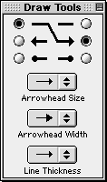
Figure C.1: Arrow tools floating window
- Source radio buttons are on the left; destination radio buttons on the right.
Choose an appearance for the source point using a source button;
choose an appearance for the destination point using a destination button.
- Arrowhead Size pop-up menu - click on this pop-up menu to open the arrowhead
size menu to select a desired size. Different sizes have
the same proportion between width and length. The selected size applies to
both source and destination ends.
- Arrowhead Width pop-up menu - click on this pop-up menu to access the
width pop-up menu, to select a desired width. Different width have
the same length. The selected width applies to both source and destination ends.
- Line Thickness pop-up menu - click on this pop-up menu to access the thickness
popup list, to select a desired thickness. The selected thickness
applies to the source, the line, as well as the destination.
Formula Tools
Formula tools are for writing formatted mathematical formulae.
To add a formula, have the formula draw tools window upfront,
click the mouse once at the center of where the formula is desired,
an easy button floating window will appear to provide help in formula entry,
and the formula can be entered.
To resize, move, or delete a formula, refer to
the pointer control and active objects manual sections.
Formula entry and editing can be customized using formula tools, displayed and
explained as follows:
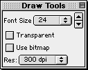
Figure C.2: Formula Tools Floating Window
- Font size pop-up menu and finetune arrows -
each click on the finetune up arrow increases the font size by 1;
each click on the finetune down arrow reduces it by 1.
- Transparent background checkbox
- Use bitmap checkbox
- Resolution pop-up menu
Text Tool
Text tools are for adding text.
To add a text object, have the text draw tools window upfront,
click the mouse once at the center of where the text is desired,
A text editing window will appear automatically for entering text contents, as follows:
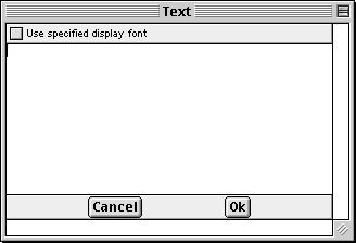
Figure C.3: A Text Editing Window
- The text region is for entering and displaying the text.
- The Cancel button cancels adding text, and closes the text editing window.
- The Ok button completes text editing, closes the text editing window,
and adds the text to the graph view or page.
To resize, move, or delete a text object, refer to
the pointer control and active objects manual sections.
Text entry and editing can be formatted using text tools, displayed and
explained as follows:
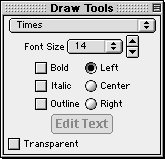
Figure C.4: Text Tools Floating Window
- Font pop-up menu
- Font Size pop-up menu and finetune arrows
each click on the finetune up arrow increases the font size by 1;
each click on the finetune down arrow reduces it by 1.
- Text format checkboxes for Bold, Italic, and Outline fonts
- Text alignment radio buttons for
Left, Center, and Right alignment
- Edit Text button - click on this edit button to return to the text editing
window, to change the text contents. This button is greyed out (inactive) when the text
tool is first accessed and a text object has not been entered yet.
- Transparent background checkbox
Box Tools
The box tools are for drawing rectangle boxes.
To add a box object, have the box draw tools upfront, bring the mouse to one corner of
the desired box, hold down the mouse and drag it to the opposite corner to release the mouse.
To resize, move, or delete a box object, refer to
the pointer control and active objects manual sections.
Box drawing can be customized using box tools, displayed and explained as follows:
Figure C.5: Box Tools Floating Window
- Box background radio buttons for
Transparent background radio button,
Colour background radio button and colour pop-up menu, and
Pattern background radio button and pattern pop-up menu.
- Line Thickness pop-up menu - The line thickness affects the
border of the box.
Appendix D. Values and Variables
There are three main groups of values and variables in GrafEq as explained following:
Numbers
Numbers are formed from the ten numeric digits (0 to 9), the decimal point,
and the negation sign. Numbers, or to be precise, digits, can only be numeric values,
and cannot be used as variables.
Numbers can be entered via the computer keyboard, the numeric keypad, or the
easy button floating window.
Tips:
Infinity (oo) is a constant, and can be entered by presing control-8.
Roman Letters
All Roman letters except for e can be used as variables or constants.
e is a predefinied constant in GrafEq, equal to 2.7182818284590452..., and is the
base of natural logarithms.
GrafEq is case sensitive, so uppercase and lowercase letters are considered
different and unique; x and X are not the same.
Roman letters can be entered via the computer keyboard, or the easy button floating window.
Greek Letters
All Greek letters except for p can be used as variables or constants.
p is a predefined constant in GrafEq, equal to 3.1415926535897932..., and is a
half circle’s angle in radian measure.
GrafEq is case sensitive, so uppercase and lowercase letters are not the same;
w and W are two different variables.
Greek characters can be entered via the easy button floating window,
or using the keyboard key combinations listed in figure D.1 following:
| Alpha | A | control-A | a | control-a |
| Beta | B | control-B | b | control-b |
| Chi | C | control-C | c | control-c |
| Delta | D | control-D | d | control-d |
| Epsilon | E | control-E | e | control-e |
| Phi | F | control-F | f | control-f |
| Gamma | G | control-G | g | control-g |
| Eta | H | control-H | h | control-h |
| Iota | I | control-I | i | control-i |
| Theta Variant | J | control-J | | |
| Phi Variant | | | j | control-j |
| Kappa | K | control-K | k | control-k |
| Lambda | L | control-L | l | control-l |
| Mu | M | control-M | m | control-m |
| Nu | N | control-N | n | control-n |
| Omicron | O | control-O | o | control-o |
| Pi | P | control-P | p | control-p |
| Theta | Q | control-Q | q | control-q |
| Rho | R | control-R | r | control-r |
| Sigma | S | control-S | s | control-s |
| Tau | T | control-T | t | control-t |
| Upsilon | U | control-U | u | control-u |
| Sigma Variant | V | control-V | | |
| Pi Variant | | | v | control-v |
| Omega | W | control-W | w | control-w |
| Xi | X | control-X | x | control-x |
| Psi | Y | control-Y | y | control-y |
| Zeta | Z | control-Z | z | control-z |
|
Figure D.1: Greek Alphabet and corresponding input key combinations
Sets
Sets can be
- discrete, containing elements listed within a pair of braces, or
- continuous - continuous sets can contain
- open ranges described within a pair of parentheses, or
- closed ranges described within a pair of square brackets.
Conclusion
To conclude this section of the manual,
following are some additional hints and tips about
GrafEq values:
- GrafEq relations can be specified in a wide latitude:
- Virtually all alphabetical characters are acceptable as variables.
- At the Create View window, any alphabetical characters entered in a relation, as
well as x, y, r, and q can be specified as domain and range variables.
- For cartesian (rectangular) graphs, domain (horizontal axis) and
range (vertical axis) variables default to x and y; for polar graphs,
q and r. All defaults can be modified.
- Hint:
In both cartesian and polar graphs, r defaults to the distance from the origin,
and q to the position angle in radians.
- Some characters are reserved in GrafEq to be values, therefore, they cannot be
used to represent variables. These values include: p, e, oo, as well as
all numeric digits.
- Variable names must be atomic; xy means two variables, and cannot be used as
one variable name.
Appendix E. Keyboard Shortcuts
File Menu
| command-N | New Graph |
| command-O | Open |
| command-W | Close Window |
| command-S | Save |
| command-. | Halt Graphing |
| command-Q | Quit |
|
Edit Menu
| command-X | Cut |
| command-C | Copy |
| command-V | Paste |
View Buddy
| C | Colour | control-B | Blending (toggle on/off) |
| | | control-C | Colour (toggle on/off) |
| | | control-T | Tick (toggle on/off) |
| | | control-# | Activate Relation Number# (toggle on/off) |
| |
| D | Draw | control-up arrow | move up one layer |
| | | control-down arrow | move down one layer |
| | | control-spacebar | Revert to previous tool |
| | | control-delete | erase current object |
| | | or control-del | |
| |
| I | Information | control-# | Show Relation Number# |
| | | control-0 | Show Totals |
| | | control-S | Show work (toggle on/off) |
| |
| T | Ticks | | |
| |
| Z | Zoom | control-click | override “Keep this view...” option |
| | | control-right arrow | enlarge zoom box, both width and length |
| | | or control-up arrow | |
| | | control-left arrow | shrink zoom box, both width and length |
| | | or control-down arrow | |
| | | shift-right arrow | accelerated zoom box widening |
| | | shift-up arrow | accelerated zoom box lengthening |
| | | shift-left arrow | accelerated zoom box narrowing |
| | | shift-down arrow | accelerated zoom box shortening |
|
| 1 | 1-Point | mouse click | jump to the curve |
| | | mouse drag | ride the curve |
| | | right arrow | move right 1 pixel precisely |
| | | up arrow | move up 1 pixel precisely |
| | | left arrow | move left 1 pixel precisely |
| | | down arrow | move down 1 pixel precisely |
|
| 2 | 2-Point | spacebar | interchange points A and B |
| | | A | set cursor to point A |
| | | B | set cursor to point B |
To conclude this section of the manual,
following are some additional hints and tips about
GrafEq’s keyboard shortcuts:
- Either uppercase or lowercase letters can be used.
Tutorial I. A Beginner’s Guided Tour
In this exercise, we will overview GrafEq’s functionality.
While the many screenshots and pictures serve as a pleasant introduction to general users,
the step-by-step explanations will help the novice students follow through.
- For a general description for the GrafEq program, visit the online description page at
http://www.peda.com/grafeq/.
- For an overview of the program’s functionalities, visit the online specifications page at
http://www.peda.com/grafeq/.
- For a complete reference, consult the
GrafEq manual.
To launch the program
- Double-click on the GrafEq icon, as seen in figure I.1 following:

Figure I.1: The GrafEq icon
- A splash screen appears, which gradually reveals the GrafEq title screen, as
seen in figure I.2 following. Press the space bar once to clarify the splash
screen, and once more to remove it.

Figure I.2: The GrafEq logo
- The Relation #1 algebraic window then opens automatically, as
seen in figure I.3 following:
Figure I.3: An Algebraic Relation Window
To enter a relation
- Ensure that the caps lock key is not depressed.
- Follow the step sequence, which will be provided, to enter the relation
as seen in figure I.4 following:
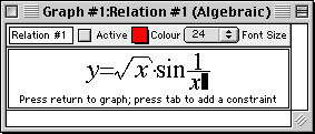
Figure I.4: y=sqrt(x)sin1/x
The necessary step sequence is as follows (Refer to the hints immediately
following regarding easy buttons and prompts.):
- Type in “y=”;
- Click the sqrt() easy button;
- Type in “x”, then “)”, noting the prompt at the bottom of
the relation window, that says “Press ) to finish the term”;
- Type in “sin1/x”.
Some general hints about entering relation specifications:
- Use the keyboard to enter letters, digits, brackets, and simple symbols such as
+, -, *, /, !, >, <, =, ...
- Use easy buttons
to enter special characters and
operators, such as algebraic powers and roots.
Figure I.5 following shows the easy button floating window:
Figure I.5: Easy Button Floating Window
- The relation window also displays a prompt message to guide the user.
In an empty relation window, as in figure I.5, the help message prompts the user
to enter a relation.
Other appropriate messages appear at different stages of relation input.
- The relation window parses entries as a relation specification is being entered, and
displays them in standard mathematics format. The sequence of keyboard keys pressed
can be revealed by moving the cursor from the end of the entry line to the left.
- To make changes to the relation, or correct typing mistakes:
- position the cursor, with the mouse or the left and right arrow keys, to
where changes are to be made; (Any relation portions now behind the cursor
would become unformatted, as a sequence of keyboard entries;
don’t worry about them, they will become formatted again when
relation entry is completed, or when the cursor is placed back to the end
of the entry line.)
- press the delete key to erase the character
to the left of the cursor, and
press the del key to erase the character to the right of the cursor;
- The prompt message at the bottom of the window now states
“Press return to graph...”
Press return now. The Create View window will then appear.
Figure I.6 following is the create view window:
Figure I.6: The Create View Window
To specify a viewport
- GrafEq can plot both Cartesian and Polar graphs, and will automatically set
the default mode according to the relation entered.
The graph mode can be changed by clicking its radial butto.
Since we have entered Relation #1 as a rectangular relation,
Cartesian mode is active (by default) in our Create View window, and we will not
change that.
- We will not change the default domain (horizontal) and range (vertical) bounds,
but any of them can be changed by:
- clicking on the box of the bound to be changed; then
- editing the number in the box; and
- repeating the steps for any other bounds to be changed.
To create a graph
- Create the specified view by clicking the Create button, or simply pressing return
as the Create button is the default button. (The thick border around the Create button
denotes that it is the default button.)
The graph view, with an accompanying view buddy floating window appear as
in figure I.7 following:

Figure I.7: Graph view of y=sqrt(x)sin1/x, and the view buddy
To apply or remove axes and scales
Figure I.7 shows axes and scales applied to the graph; the steps required to
remove or apply them are as follows:
- Go to the view buddy, click and hold down the mouse on the mode pop-up menu on the top
of the floating window; a pull down list appears.
- Drag the mouse down the list to Ticks, then release the mouse to enter Ticks mode.
- Click on each of the four buttons in turn to see the different ticks. Figure I.7
uses the second button.
- The Show Ticks checkbox on top of the buttons is selected. To hide the ticks,
click on the checkbox once to toggle ticks inactive. (One more click and
the ticks will be toggled active, into the last state selected.)
To alter the viewport region by zooming
The graph presents a good overview of the relation over the domain and range of
[-10, 10]. But the interesting portion seems to be a smaller region at the center.
Although we could have created a view with narrower bounds in the Create View window,
it is now more convenient for us to change the viewport region with
GrafEq’s zoom feature.
- Return to the view buddy, and enter zoom mode by selecting
Zoom from the mode pop-up menu which is on the top of the floating window.
- The Zoom-Out button is on the view buddy now, but there is not a button for
zooming in, since we have to specify the region to be zoomed into.
- Place the mouse cursor within the graph view; a yellow zoom box will appear.
- Place the zoom box at the graph’s interesting portion, close to the center,
as seen in figure I.8 following:

Figure I.8: Zooming into a graph's interesting area, with the zoom buddy
- Click once to see the selected region, as View #2.
- Zoom in to the center once again, to create View #3, as seen in figure I.9 following:

Figure I.9: A good view of the graph's interesting area
To edit a relation
We will edit the relation, from y=sqrt(x)sin1/x to
y=x2sinx2.
- Bring the relation window back up front, to be the active window:
If some part of the window is visible, click on it once. Alternatively,
go to GrafEq’s top Graph menu, drag the mouse down to Relation #1(Algebraic), and
release the mouse to select the algebraic window for Relation #1.
| Hint: |
- the relation window appears but not the prompt message,
or the easy button floating window,
- the Active box in the relation window is selected, and
- the graph of Relation #1 is shown in the View #3 window.
|
|
- Click once on the relation, to invoke its edit mode.
| Hint: |
- the prompt message appears in the relation window,
and the easy button floating window appears next to the relation window,
- the Active box in the relation window is cleared, and
- the graph of Relation #1 is not shown in the View #3 window.
|
|
- Place the cursor just in front of “sin”, as seen in figure I.10 following:
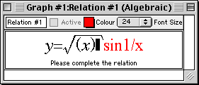
Figure I.10: Relation #1 being edited
| Tip: |
- Move the cursor by clicking the mouse in the area, or
- by repeatedly pressing the left arrow key.
|
|
| Hint: |
- The relation portion behind the cursor becomes unformatted.
- Don’t worry about it; it will be automatically
reformatted as they pass to the left side of the cursor.
|
|
- Erase the sqrt(x) term by either:
- highlight the term with the mouse and cursor, then press the del key, or
- press the delete key until the term is removed.
- Enter x2 as follows:
- Type in x from the keyboard;
- Go to the easy button floating window, and click the
arrow adjacent to the algebra easy button set to open it;
- Click the a2 button once, and the relation window will look
like figure I.11 following:
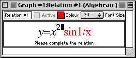
Figure I.11: Relation #1 edited
- Move the cursor to the rightmost end of the relation, and see that the entire
relation becomes formatted again, by:
- clicking the mouse there, or
- repeatedly pressing the right arrow key until the cursor is there, or
- holding down the control key and pressing the right arrow key once.
- Press the delete key three times to remove the 1/x term.
- Enter x2 one more time to complete relation editing, as
seen in figure I.12 following:
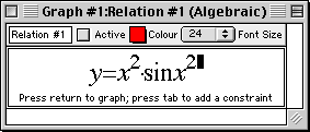
Figure I.12: Relation #1 edited
- Press return to see the new graph plotted in the View #3 window.

Figure I.13: Graph of the edited Relation #1
- The new graph above does not look very interesting. But note that the scales show very
small numbers, and remember that we had zoomed in twice to produce View #3;
we will now zoom back out to take a look at the “bigger picture”.
- Return to the zoom buddy, referring to the steps just described earlier when altering
the viewport region, press the Zoom Out button to zoom out.
The result of zooming out is intriguing. The following picture, View #7, is
obtained after clicking the Zoom Out button four times.

Figure I.14: Graph of the edited Relation #1 after four zoom-outs
To use constraints in defining a relation
Note that the graph in figure I.14 is much simpler where x is small
(less than three). We will now produce a simple graph whose domain is [0,3].
We have learned that:
- we can define the bounds in the Create View window, and that
- we can use the zoom feature of GrafEq.
Now we will use contraints in defining a relation.
- Make the relation window the active window,
referring to the steps just described earlier when editing a relation.
- The prompt message at the bottom of the window states “....press
tab to add a constraint.”. Press the tab key now.
- Enter the constraint “0<x<3”, as seen in figure I.15 following:
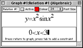
Figure I.15: Relation #1 with second constraint
- Press return for the resulting graph, as seen in figure I.16 following:

Figure I.16: Graph of Relation #1 with two constraints
Congratulations! You have completed the first part of this walkthrough exercise!
Before you continue on to the next section of the exercise, it is good practice
to close your current graph, to free up the computer’s memory and screen space.
To close your graph:
- press the mouse button on the File menu, then
- drag the mouse down the pulldown menu to Close Graph, and
release the button to close your graph.
Graphs may also be saved, for future re-use. A later tour will discuss saving graphs
in the various formats supported by GrafEq.
In this section, we will look at graphing multiple relations on the same graph,
and a few other features of GrafEq.
To plot simultaneous systems
- Under the File menu select New Graph, to get a new relation window.
- Enter Relation #1 as seen in figure I.17 following,
(with the help of the easy buttons for square operations):
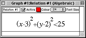
Figure I.17: Relation #1 for the simultaneous system
- Press return after Relation #1 is entered correctly, to get to
the Create View Window.
- The default settings are fine, so press return or click on Create to
create a graph.
- Under the Graph menu, select New Relation, to get another
relation window (entitled Relation #2).
- Enter the second relation,
referring to figure I.18 following, then press return.
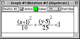
Figure I.18: Relation #2 for the simultaneous system
- Open another relation window (entitled Relation #3), by
selecting New Relation under the Graph menu.
- According to figure I.19 following, enter the first constraint of the relation, press Tab,
then enter the second constraint of the relation:

Figure I.19: Relation #3 for the simultaneous system
- Press return; your graph now shows all three relations in three different colours,
layered with Relation #1 at the bottom, then Relation #2, and finally Relation #3
on top, as seen in figure I.20 following:

Figure I.20: Graph of the simultaneous system
To blend graphs of simultaneous systems
- Return to the view buddy, and return to colour mode by selecting
Colour from the mode pop-up menu on the top of the floating window.
- Click to select the Blend checkbox. The graphs for the simultaneous systems become
blended, revealing individual graphs and intersections of the simultaneous system,
as seen in figure I.21 following:
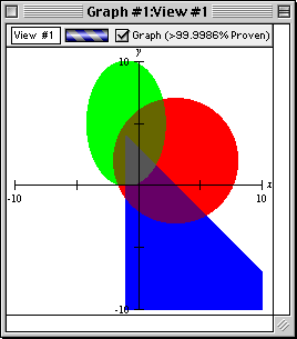
Figure I.21: Blended graph of the simultaneous system
To determine a point’s coordinates
- Return to the view buddy, and enter One Point mode by selecting
One Point from the mode pop-up menu on the top of the floating window.
- Place the mouse close to an intersection point on the graph; pin down the point
with the help of the magnified view on the view buddy, as seen following:
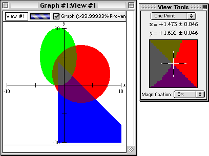
Figure I.22: Pin down an intersection point with the one point view buddy
- Read the coordinates of the point from the view buddy.
To change the colours of the graphs
- Access the colour mode view buddy again.
- Click on the colour box of Relation #1. When the colour panel appears, drag the
highlight box to choose another colour.
- Repeat the process to choose colours for any other relations.
To determine distances between points
- Access the Two Point mode of the view buddy. A line segment AB appears
on the graph.
- Use the mouse to drag points A and B to the two ends of the distance to be measured.
See figure I.23 following as an example:
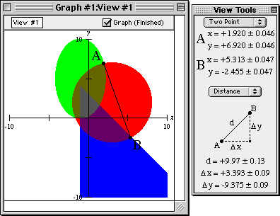
Figure I.23: Measure distance between two points with the two point view buddy
- Read the distances from the view buddy.
Congratulations! You have completed this introductory tour
and experienced the basics of GrafEq.
As a reward for completing the tour, graph the relation in figure I.24 following:
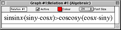
Figure I.24: Reward Relation
Many other features remain to be explored, such as:
- copying and pasting relations and graphs,
- making pages for printing,
- saving graphs to disk,
- using custom ticks,
- using one-key short-cuts, and
- customizing GrafEq for subsequent sessions.
Refer to the manual for full details of GrafEq’s functionality.
The appendices provide a useful summary and reference.
Pedagoguery Software will be placing additional tours, online at
http://www.peda.com/grafeq/tut.html,
and with the manual.

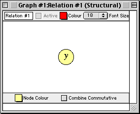
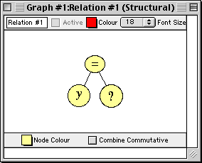
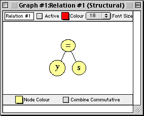
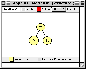

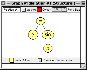
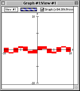
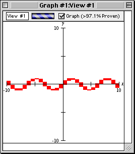

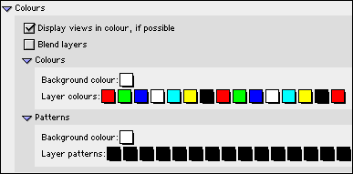
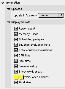
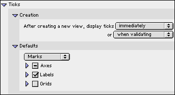
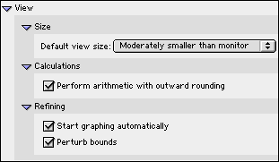
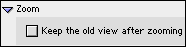